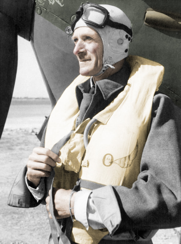
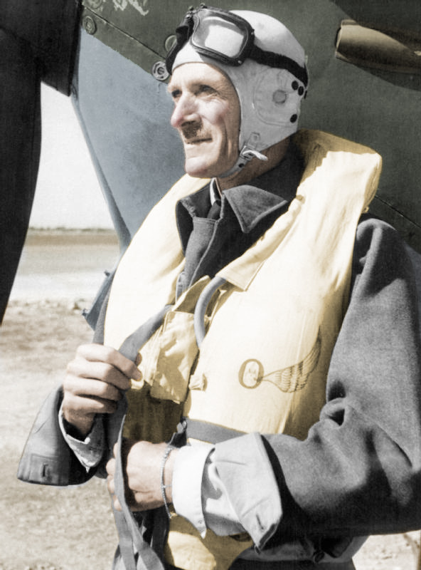
The post “The Mahogany Bomber” included a photo of Sir Keith Park in his flight suit, in front of a Spitfire. This is a famous photo from the collections of the Imperial War Museum. But the original is in black and white. I have no problem with the black and white format, but I wanted the image to bridge the history of the story with the modern relevance to leadership. I also wanted it to stand out a bit. Although the website deals with a topic that predated wide use of color photography, I try hard not to fill it with black and white imagery. So I decided to take the iconic image and colorize it.

Left: Original image, Right: Final image in color. © IWM (CM 3513)
I used Photoshop to create this image, and based my technique on the tutorial you can find here at Lynda.com. It’s not difficult, but it does require a bit of experience with the software, and a lot of patience. I’ll give a rough outline of the steps here, but before attempting this you should be comfortable with the following concepts in Photoshop: layers, masks, making selections, blending modes.
When colorizing, it’s essential to divide the image into areas with different colors. For example, in this image, the skin tone, flight suit, life jacket (Mae West), etc. should all be different colors. Each of them should be isolated on a separate layer. You can see in the image below that these areas each have a separate layer group.
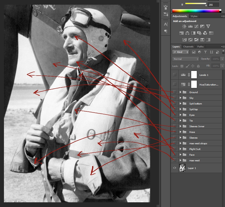
Each section of the image is edited on it own layer

Each Layer Group has a Hue/Saturation Adjustment layer clipped to the blank layer below it. The blank layer is where we will paint the color.
I use layer groups because for each item I colorize, I also add a Hue/Saturation Adjustment Layer, and add a clipping mask. This allows me to colorize a section of the image and then make adjustments to the Hue and Saturation later. That flexibility is essential.
On the new layer, I made a selection of the area I wanted to color. Use whatever selection tools you prefer. I have a digitizer so I prefer Quick Mask mode and the Brush tool.
In this example I have made a selection of the Mae West. Note that the straps are not part of the selection, they would be a different color and go on a separate layer.
Make a selection of each area to be colored.
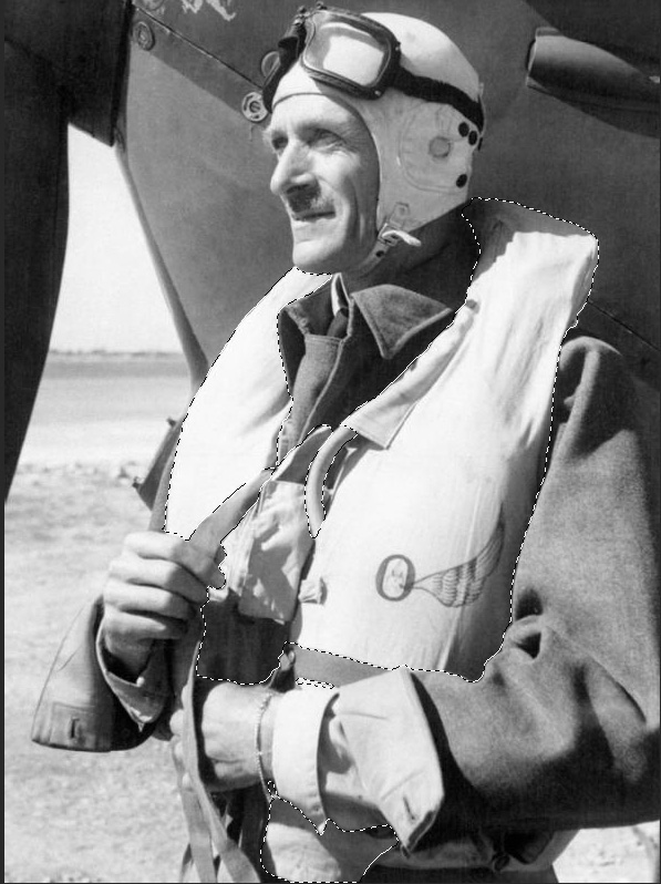
After finalizing the selection, I determined the color I wanted to paint it. I prefer to use other images as a color reference. A quick Google search of Mae Wests gives me a wealth of reference images. Open a reference file in Photoshop and use the Eye Dropper to select the color.
Now I paint the image using the Brush tool. The layer Blending Mode typically works best in Overlay, but experiment with the other modes as required. Because I have clipped the Adjustment Layer attached to the color layer, I can make adjustments to the Hue and the Saturation after I am done to achieve the best results. Subtlety is the key to effective images. I think slightly desaturated images look best.
Paint the color inside the selected area.
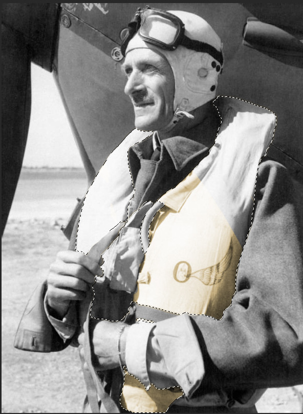
I continue added new layer groups and repeating the process above to color the other sections of the image. Working with skin tones is the hardest. Luckily I was able to find color photos of Park from his days in Malta. With faces it is important to remember that the nose, cheeks, and chin have higher blood flows, so they should be more red. I pull the color right from those areas in the reference image.
Adding color….
and more color….
Where there is no reference image, use historical descriptions. For example, I know from historical accounts that Park’s flight helmet was white.
Here is the finished image. Results may vary. I like to add final global adjustments using adjustments layers. It ties the whole image together.
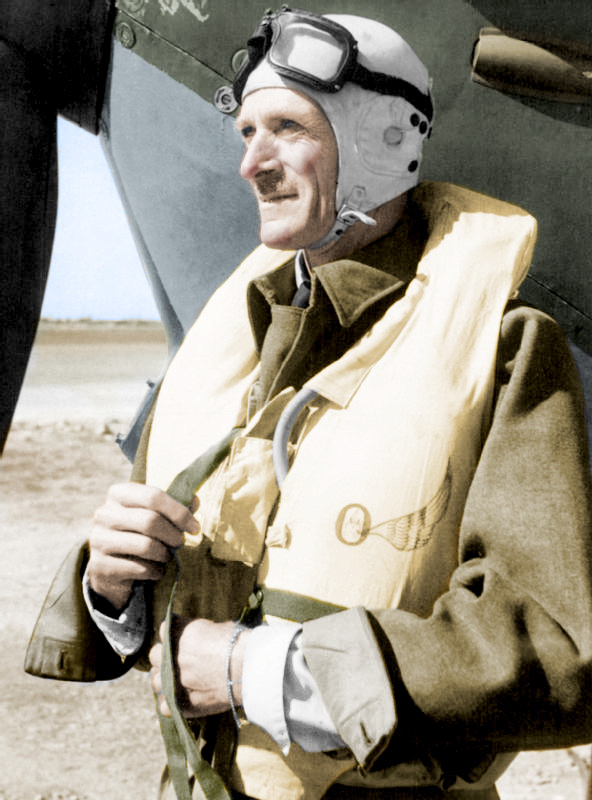
Finished.


Pingback: writeaessay()
Pingback: Viagra generika()
Pingback: essayforme()
Pingback: Generic cialis()
Pingback: Viagra kaufen()
Pingback: Viagra cialis levitra()
Pingback: Cialis online()
Pingback: Cialis prices()
Pingback: Viagra uk()
Pingback: Cialis lowest price()
Pingback: Cialis 20mg()
Pingback: Buy cialis online()
Pingback: Cialis 5 mg()
Pingback: writeaessay()
Pingback: Cialis 5 mg()
Pingback: Buy cialis online()
Pingback: Cialis 5 mg()
Pingback: newtube sirius204 abdu23na477 abdu23na56()
Pingback: newtube sirius469 abdu23na2437 abdu23na62()
Pingback: jigdf43g6344 afeu23na1048 abdu23na63()
Pingback: download on mobile667 afeu23na3520 abdu23na9()
Pingback: hd videos tubepla.net801 afeu23na6389 abdu23na15()
Pingback: 84ywFseXHH()
Pingback: hdmobilesex.me()
Pingback: buy tadalafil online()
Pingback: Buy cialis online()
Pingback: tadalafil online without a prescription()
Pingback: no 1 canadian pharcharmy online()
Pingback: Viagra pills()
Pingback: Canadian viagra()
Pingback: Buy cialis()
Pingback: Viagra generique()
Pingback: levitra generico()
Pingback: order levitra online()
Pingback: Cheap viagra()
Pingback: Viagra pills()
Pingback: levitra 10 mg prezzo()
Pingback: viagra without doctor prescription()
Pingback: online viagra()
Pingback: viagra 100mg()
Pingback: viagra()
Pingback: canadian pharmacies online()
Pingback: international pharmacy()
Pingback: canadian pharmacies online()
Pingback: drugstore online()
Pingback: canada pharmacy()
Pingback: cheap cialis()
Pingback: tadalafil()
Pingback: cialis 20 mg()
Pingback: pharmacy online()
Pingback: online pharmacy()
Pingback: generic viagra 100mg()
Pingback: hs;br()
Pingback: tureckie_serialy_na_russkom_jazyke()
Pingback: tureckie_serialy()
Pingback: 00-tv.com()
Pingback: +1+()
Pingback: æóêè+2+ñåðèÿ()
Pingback: Ñìîòðåòü ñåðèàëû îíëàéí âñå ñåðèè ïîäðÿä()
Pingback: Ñìîòðåòü âñå ñåðèè ïîäðÿä()
Pingback: watch()
Pingback: âûòîïêà âîñêà()
Pingback: ++++++()
Pingback: HD-720()
Pingback: guardians+of+the+galaxy+2()
Pingback: strong woman do bong soon()
Pingback: my id is gangnam beauty()
Pingback: guardians of the galaxy vol 2()
Pingback: 2020()
Pingback: kpop+star+season+6+ep+9()
Pingback: Video()
Pingback: 1 2 3 4 5 6 7 8 9 10()
Pingback: wwin-tv.com()
Pingback: amoxicillin()
Pingback: Watch TV Shows()
Pingback: Kinokrad 2019 Kinokrad Hd()
Pingback: Kinokrad()
Pingback: filmy-kinokrad()
Pingback: kinokrad-2019()
Pingback: filmy-2019-kinokrad()
Pingback: serial()
Pingback: cerialest.ru()
Pingback: youtube2019.ru()
Pingback: dorama hdrezka()
Pingback: movies hdrezka()
Pingback: HDrezka()
Pingback: kinosmotretonline()
Pingback: LostFilm HD 720()
Pingback: trustedmdstorefy.com()
Pingback: bofilm ñåðèàë()
Pingback: bofilm()
Pingback: 1 seriya()
Pingback: Êîíñóëüòàöèÿ ïñèõîëîãà()
Pingback: topedstoreusa.com()
Pingback: купить виагру ли()
Pingback: hqcialismht.com()
Pingback: viagramdtrustser.com()
Pingback: lindamedic.com()
Pingback: гдз макарычев 8()
Pingback: canadianpharmacystorm.com()
Pingback: gencialiscoupon.com()
Pingback: гдз по русскому класс разумовская()
Pingback: genericvgrmax.com()
Pingback: гдз львова()
Pingback: гдз по русскому бархударов()
Pingback: гдз по алгебре 7 мордкович()
Pingback: viagrawithoutdoctorspres.com()
Pingback: гдз по русскому тростенцова()
Pingback: гдз по геометрии 7 класс()
Pingback: canpharmb3.com()
Pingback: гдз по английскому языку 8()
Pingback: гдз по английскому 10()
Pingback: rick and morty season 3()
Pingback: Evil-Season-1()
Pingback: Evil-Season-2()
Pingback: Evil-Season-3()
Pingback: Evil-Season-4()
Pingback: Dollface-Season-1()
Pingback: Queer-Eye-We-re-in-Japan-Season-1()
Pingback: гдз по русскому 8 класс()
Pingback: гдз математика 6 класс виленкин()
Pingback: гдз 10 11 по алгебре()
Pingback: canphpwronline.com()
Pingback: serial 2020()
Pingback: Dailymotion()
Pingback: Watch+movies+2020()
Pingback: serial-video-film-online()
Pingback: tvrv.ru()
Pingback: 1plus1serial.site()
Pingback: #1plus1()
Pingback: 1plus1()
Pingback: Watch Movies Online()
Pingback: Film()
Pingback: Film 2020()
Pingback: Film 2021()
Pingback: Top 10 Best()
Pingback: watch online TV LIVE()
Pingback: human design()
Pingback: dizajn cheloveka()
Pingback: human-design-space()
Pingback: koma 2020()
Pingback: hischnye-pticy-hisxne-ptic()
Pingback: The-Gentlemen()
Pingback: led-2()
Pingback: pod-vodoi()
Pingback: vk 2020()
Pingback: parazity-oskar-2020()
Pingback: human design human design()
Pingback: DSmlka()
Pingback: viagra()
Pingback: viagra online()
Pingback: +()
Pingback: ¯jak Son³k()
Pingback: astrolog()
Pingback: film-kalashnikov-watch()
Pingback: generic cialis()
Pingback: cialis 20mg()
Pingback: viagra online()
Pingback: generic viagra india()
Pingback: generic viagra()
Pingback: kinoxaxru.ru()
Pingback: pobachennya u vegas()
Pingback: Proshanie so Stalinym()
Pingback: viagra pills()
Pingback: buy cialis()
Pingback: generic viagra()
Pingback: buy cialis cheap()
Pingback: levitra()
Pingback: cialis pills()
Pingback: strelcov 2020()
Pingback: film t-34()
Pingback: online pharmacy()
Pingback: canadian pharmacy()
Pingback: Cialis price()
Pingback: cialis generic()
Pingback: sildenafil citrate()
Pingback: sildenafil()
Pingback: Beograd film 2020()
Pingback: buy viagra()
Pingback: generic cialis()
Pingback: viagra()
Pingback: psiholog()
Pingback: psyhelp_on_line()
Pingback: coronavirus()
Pingback: PSYCHOSOCIAL()
Pingback: rasstanovka hellinger()
Pingback: Discount canadian viagra()
Pingback: cialis otc()
Pingback: Cherekasi film 2020()
Pingback: buy chloroquine phosphate online()
Pingback: price of cialis()
Pingback: levitra dosage()
Pingback: cialis canada()
Pingback: Viagra brand()
Pingback: viagra pills()
Pingback: Free viagra()
Pingback: film doktor_liza()
Pingback: cialis on line()
Pingback: cialis walmart()
Pingback: djoker film()
Pingback: medications without a doctor's prescription()
Pingback: cialis pill()
Pingback: buy cialis canada()
Pingback: cbd oil reviews()
Pingback: cbd()
Pingback: generic viagra online pharmacy()
Pingback: buy viagra online()
Pingback: anti coronavirus drugs()
Pingback: buy cialis online safely()
Pingback: gidonline-filmix.ru()
Pingback: online prescription for ed meds()
Pingback: koronavirus-v-ukraine-doktor-komarovskiy()
Pingback: cost of cialis()
Pingback: buy cialis()
Pingback: viagra without a doctor prescription usa()
Pingback: cialis manufacturer coupon 2019()
Pingback: cialis over counter()
Pingback: discount cialis()
Pingback: generic viagra 100mg()
Pingback: buy kaletra online()
Pingback: buy careprost()
Pingback: viagra for sale()
Pingback: cialis india()
Pingback: chloroquine purchase online()
Pingback: online pharmacy viagra()
Pingback: best generic viagra()
Pingback: viagra 50mg()
Pingback: cialis online()
Pingback: viagra 50mg()
Pingback: viagra generic()
Pingback: over the counter viagra()
Pingback: Canadian Online Pharmacies()
Pingback: Canadian Pharcharmy Online()
Pingback: cialis xtl generic()
Pingback: non prescription ed pills()
Pingback: best price for tadalafil 20 mg()
Pingback: best ed pills()
Pingback: cheap viagra()
Pingback: best non prescription ed pills()
Pingback: viagra()
Pingback: cialis online()
Pingback: sample viagra()
Pingback: viagra without a doctor prescription()
Pingback: 10 mg tadalafil generic()
Pingback: t.me/psyhell()
Pingback: Ïñèõîëîã îíëàéí()
Pingback: best online pharmacy()
Pingback: Viagra or cialis()
Pingback: prescription drugs online without doctor()
Pingback: bitly.com()
Pingback: viagra 100mg()
Pingback: viagra price()
Pingback: viagra coupon()
Pingback: cheap viagra()
Pingback: cialis()
Pingback: cialis coupon()
Pingback: canadian pharmacy cialis()
Pingback: cialis 5mg()
Pingback: levitra generic()
Pingback: cialis without doctor prescription()
Pingback: vardenafil pill()
Pingback: cheap viagra usa()
Pingback: best online casino for money()
Pingback: play online casino real money()
Pingback: rlowcostmd.com()
Pingback: generic viagra()
Pingback: casino moons online casino()
Pingback: casino online slots()
Pingback: viagra prescription()
Pingback: bitly()
Pingback: cash payday()
Pingback: viagra generic()
Pingback: movies-tekstmovies-tekst()
Pingback: payday loans online()
Pingback: buy cialis online()
Pingback: no credit check loans()
Pingback: Zemlyane 2005 smotret onlajn()
Pingback: buy prescription drugs online()
Pingback: red tiger slots()
Pingback: viagra pills()
Pingback: casino online slots()
Pingback: cialis 5 mg()
Pingback: hollywood casino online()
Pingback: enrique()
Pingback: online casino games for real money()
Pingback: can viagra 100mg be dangerous()
Pingback: cialis buy()
Pingback: pharmacy()
Pingback: cialis generic()
Pingback: cialis internet()
Pingback: order propecia()
Pingback: cialis buy()
Pingback: cbd oil benefits()
Pingback: 20 cialis()
Pingback: best cbd oil()
Pingback: golden nugget online casino()
Pingback: smotret onlajn besplatno v kachestve hd 1080()
Pingback: cbd oil()
Pingback: gusmeasu.com()
Pingback: movies-unhinged-film()
Pingback: malenkie-zhenshhiny-2020()
Pingback: dom 2()
Pingback: online casino games real money()
Pingback: casino()
Pingback: levitra coupon()
Pingback: real casino()
Pingback: zoom-psykholog()
Pingback: zoom-viber-skype()
Pingback: online prescription for ed meds()
Pingback: sildenafil viagra()
Pingback: cheapest viagra()
Pingback: generic viagra()
Pingback: Vratar Galaktiki Film, 2020()
Pingback: buy viagra online usa()
Pingback: Vratar()
Pingback: Cherkassy 2020()
Pingback: chernobyl-hbo-2019-1-sezon()
Pingback: viagra cheap()
Pingback: erectile dysfunction pills()
Pingback: viagra without a doctor prescription()
Pingback: moskva-psiholog()
Pingback: generic cialis 20mg()
Pingback: viagra prescription()
Pingback: batmanapollo.ru()
Pingback: generic viagra for sale()
Pingback: cheaper metformin()
Pingback: viagra for sale()
Pingback: buy viagra uk()
Pingback: buy prednisone()
Pingback: 323()
Pingback: 525()
Pingback: hydroxychloroquine over the counter()
Pingback: dom2-ru()
Pingback: Tenet Online()
Pingback: buy cialis()
Pingback: casino real money()
Pingback: buy viagra online shop()
Pingback: http://droga5.net/()
Pingback: psy psy psy psy()
Pingback: average cost of viagra 100mg()
Pingback: viagra without a doctor prescription()
Pingback: buy cheap viagra()
Pingback: generic viagra()
Pingback: Viagra 130 mg nz()
Pingback: cheap sildenafil()
Pingback: krsmi.ru()
Pingback: Viagra 100 mg cheap()
Pingback: Viagra 100mg uk()
Pingback: generic cialis online()
Pingback: Viagra 120mg online()
Pingback: Viagra 120mg generic()
Pingback: buy sildenafil generic()
Pingback: Viagra 120 mg medication()
Pingback: cialis cialis()
Pingback: Viagra 120mg no prescription()
Pingback: viagra pills()
Pingback: order Cialis 40 mg()
Pingback: Cialis 40mg without prescription()
Pingback: Cialis 40mg united states()
Pingback: canadian viagra()
Pingback: cheapest Cialis 10 mg()
Pingback: cialis online()
Pingback: viagra pills()
Pingback: sildenafil()
Pingback: Cialis 60mg tablet()
Pingback: like-v.ru()
Pingback: Cialis 80 mg united kingdom()
Pingback: Cialis 40 mg prices()
Pingback: sildenafil 200mg over the counter()
Pingback: viagra cheap()
Pingback: canadian drugs pharmacy()
Pingback: tadalafil 20mg pills()
Pingback: cheapest levitra 40 mg()
Pingback: lasix 40 mg without a prescription()
Pingback: propecia 5mg medication()
Pingback: lexapro 5 mg price()
Pingback: cheap viagra()
Pingback: canadian pharmacy viagra()
Pingback: abilify 15mg pills()
Pingback: viagra generique livre sous 48h()
Pingback: actos 30 mg price()
Pingback: aldactone 25 mg canada()
Pingback: CFOSPUK()
Pingback: MAMprEj()
Pingback: fgu0ygW()
Pingback: allegra 180 mg no prescription()
Pingback: buy allopurinol 300mg()
Pingback: amaryl 4mg australia()
Pingback: amoxicillin 500mg purchase()
Pingback: http://cialistodo.com()
Pingback: ampicillin 250mg over the counter()
Pingback: where to buy antabuse 500mg()
Pingback: antivert 25 mg tablets()
Pingback: arava 10mg no prescription()
Pingback: cheapest strattera 10mg()
Pingback: aricept 5 mg online()
Pingback: grapefruit viagra()
Pingback: arimidex 1mg cheap()
Pingback: order cialis()
Pingback: tamoxifen 20 mg cost()
Pingback: ashwagandha 60caps coupon()
Pingback: cialis by mail()
Pingback: atarax 10mg without a prescription()
Pingback: augmentin 875/125mg without prescription()
Pingback: generic pills without a doctor prescription()
Pingback: avapro 300 mg cheap()
Pingback: avodart 0,5mg online()
Pingback: viagra pfizer()
Pingback: cheap baclofen 10mg()
Pingback: how to buy bactrim 400/80 mg()
Pingback: how to purchase benicar 20 mg()
Pingback: sildenafil citrate generic viagra 100mg()
Pingback: canadian pharmacy viagra()
Pingback: cialis coupon()
Pingback: Biaxin 500 mg cheap()
Pingback: Premarin 0,625mg for sale()
Pingback: how to buy buspar 10 mg()
Pingback: cialis 20mg review()
Pingback: calcium carbonate 500mg otc()
Pingback: pfizer generic viagra()
Pingback: akmeologiya()
Pingback: dizain cheloveka()
Pingback: human-design-hd()
Pingback: buy viagra without prescription canada()
Pingback: cialis for sale()
Pingback: casodex without prescription()
Pingback: order catapres()
Pingback: ceclor medication()
Pingback: generic viagra()
Pingback: ceftin generic()
Pingback: celebrex medication()
Pingback: celexa generic()
Pingback: ed pills that work()
Pingback: buy cephalexin()
Pingback: cipro pills()
Pingback: buy viagra generic()
Pingback: cost of claritin()
Pingback: online casino games()
Pingback: sildenafil citrate 20 mg()
Pingback: vegas casino online()
Pingback: win real money online casino for free()
Pingback: pala casino online()
Pingback: casino online games()
Pingback: gambling games()
Pingback: generic ed pills()
Pingback: online slots real money()
Pingback: female viagra prank on girlfriend jen hamilton()
Pingback: real online casino()
Pingback: play casino()
Pingback: online casino()
Pingback: best insurance car()
Pingback: full coverage insurance()
Pingback: cheapest online car insurance quotes()
Pingback: viagra for sale in dublin()
Pingback: foremost car insurance quotes()
Pingback: cialis()
Pingback: personal car insurance()
Pingback: insurance for young drivers()
Pingback: affordable insurance()
Pingback: best generic cialis()
Pingback: buy cialis()
Pingback: au cialis()
Pingback: batmanapollo()
Pingback: autoowners insurance()
Pingback: impotance()
Pingback: car insurance quotes rates()
Pingback: au cialis()
Pingback: accc car insurance()
Pingback: texas personal loans()
Pingback: drug prices comparison()
Pingback: 24 hour payday loans()
Pingback: online viagra()
Pingback: places to get payday loans()
Pingback: cialis online()
Pingback: installment loans online()
Pingback: quick loans in md()
Pingback: tsoy()
Pingback: bad credit loans flint mi()
Pingback: national payday loan()
Pingback: online personal loans texas()
Pingback: buy cialis online()
Pingback: cbd oil benefits bloods()
Pingback: buy cbd oil()
Pingback: amoxicillin 500mg capsule buy online()
Pingback: purchase viagra mexico()
Pingback: cbd cannabis oil for sale()
Pingback: how to purchase viagra in uk()
Pingback: wikipedia viagra()
Pingback: can you buy viagra without a prescription()
Pingback: cbd hemp oil benefits()
Pingback: speedy cash payday loans online()
Pingback: buy levitra discount()
Pingback: ananda professional cbd oil()
Pingback: real viagra from canada()
Pingback: cbd oil products()
Pingback: cheap sildenafil online canada()
Pingback: cbd oil for pets()
Pingback: where can i buy levitra in australia()
Pingback: 44548()
Pingback: 44549()
Pingback: cbd oil for pain management()
Pingback: hod-korolevy-2020()
Pingback: Viagra 100mg england()
Pingback: sildenafil usa()
Pingback: wake county school assignments()
Pingback: college paper writer()
Pingback: viagra store usa()
Pingback: mba essay writing services()
Pingback: english essay writer()
Pingback: buy cheap essays()
Pingback: homeworks of america()
Pingback: can you purchase viagra in mexico()
Pingback: professional essay writer()
Pingback: HD()
Pingback: cheap research paper writers()
Pingback: buy essay online safe()
Pingback: writing my essay()
Pingback: cheap viagra online india()
Pingback: how to purchase clomid 50 mg()
Pingback: cialis generico 5mg costo()
Pingback: 158444()
Pingback: Buy viagra australia()
Pingback: clonidine cost()
Pingback: clozaril 25 mg pharmacy()
Pingback: viagra maximum dose()
Pingback: groznyy-serial-2020()
Pingback: colchicine 0,5mg without a doctor prescription()
Pingback: Order viagra us()
Pingback: symbicort inhaler 160/4,5 mcg tablet()
Pingback: free cialis()
Pingback: combivent otc()
Pingback: coreg 25 mg united kingdom()
Pingback: cialis with prozac()
Pingback: help me with my essay()
Pingback: how to buy compazine()
Pingback: 38QvPmk()
Pingback: bitly.com/doctor-strange-hd()
Pingback: bitly.com/eternals-online()
Pingback: coumadin cheap()
Pingback: bitly.com/maior-grom()
Pingback: matrica-film()
Pingback: dzhonuikfilm4()
Pingback: bitly.com/batman20212022()
Pingback: bitly.com/venom-2-smotret-onlajn()
Pingback: bitly.com/nevremyaumirat()
Pingback: bitly.com/kingsmankingsman()
Pingback: bitly.com/3zaklyatie3()
Pingback: bitly.com/1dreykfilm()
Pingback: cost of cozaar()
Pingback: bitly.com/topgunmavericktopgun()
Pingback: bitly.com/flash2022()
Pingback: bitly.com/fantasticheskietvari3()
Pingback: bitly.com/wonderwoman1984hd()
Pingback: viagra soft 100mg()
Pingback: customessaywriterbyz.com()
Pingback: order generic cialis()
Pingback: cost of cymbalta 40 mg()
Pingback: how to get viagra without a doctor()
Pingback: dapsone caps united states()
Pingback: thesis database()
Pingback: Canada viagra generic()
Pingback: ddavp online pharmacy()
Pingback: cheapest depakote()
Pingback: diamox for sale()
Pingback: how to buy differin()
Pingback: diltiazem 120 mg cheap()
Pingback: doxycycline 100mg for sale()
Pingback: buy viagra()
Pingback: how to purchase dramamine 50 mg()
Pingback: elavil medication()
Pingback: erythromycin 500 mg nz()
Pingback: canada drug pharmacy()
Pingback: 1444()
Pingback: how to buy etodolac()
Pingback: meds online without doctor prescription()
Pingback: where to buy flomax()
Pingback: cialis order online()
Pingback: flonase nasal spray 50mcg generic()
Pingback: what is the best essay writing service()
Pingback: garcinia cambogia 100caps usa()
Pingback: best pill for ed()
Pingback: geodon 80mg tablets()
Pingback: hyzaar 12,5 mg nz()
Pingback: imdur 20 mg pills()
Pingback: imitrex 50mg purchase()
Pingback: cialis reviews()
Pingback: canadian pharmacy cialis()
Pingback: cialis online()
Pingback: imodium 2 mg without a prescription()
Pingback: cialis without a doctor prescription()
Pingback: viagra for men online()
Pingback: have a peek here()
Pingback: canadian viagra()
Pingback: viagra effects()
Pingback: where can i buy viagra()
Pingback: what is viagra()
Pingback: canadian online pharmacies()
Pingback: imuran united states()
Pingback: order generic cialis online()
Pingback: indocin for sale()
Pingback: generic zithromax 500mg()
Pingback: lamisil 250 mg pills()
Pingback: levaquin 750mg tablets()
Pingback: generic viagra 100mg()
Pingback: where to buy lopid 300mg()
Pingback: generic viagra()
Pingback: buy lopressor()
Pingback: luvox online()
Pingback: macrobid no prescription()
Pingback: meclizine 25 mg pharmacy()
Pingback: viagra dose size()
Pingback: best erectile dysfunction pill()
Pingback: mestinon 60 mg over the counter()
Pingback: Viagra Oral Jelly()
Pingback: micardis 80 mg without a prescription()
Pingback: generic Aciclovir()
Pingback: online pharmacy no prescription()
Pingback: mobic 7,5 mg coupon()
Pingback: cleantalkorg2.ru()
Pingback: 232dfsad()
Pingback: http://www.fjsh.cy.edu.tw/modedu/netlin ... illusa.com()
Pingback: motrin tablet()
Pingback: canada drug pharmacy()
Pingback: nortriptyline united kingdom()
Pingback: periactin 4mg united kingdom()
Pingback: can you buy viagra over the counter()
Pingback: canada online pharmacy()
Pingback: phenergan without a doctor prescription()
Pingback: plaquenil pills()
Pingback: prednisolone without a prescription()
Pingback: prevacid cost()
Pingback: prilosec 10 mg pills()
Pingback: proair inhaler 100 mcg united states()
Pingback: viagra walgreens()
Pingback: order procardia 30mg()
Pingback: cleantalkorg2.ru/sitemap.xml()
Pingback: proscar 5 mg tablet()
Pingback: protonix cheap()
Pingback: provigil 100mg without a prescription()
Pingback: generic viagra()
Pingback: pulmicort without a doctor prescription()
Pingback: how to order doxycycline()
Pingback: buy sale viagra()
Pingback: how to purchase pyridium 200 mg()
Pingback: reglan pills()
Pingback: join vk()
Pingback: vk login()
Pingback: amoxicillin 500 mg online()
Pingback: cheapest remeron()
Pingback: retin-a cream 0.025% prices()
Pingback: zyrtec syrup()
Pingback: cheap revatio()
Pingback: order risperdal()
Pingback: robaxin without a doctor prescription()
Pingback: rogaine united kingdom()
Pingback: cost of singulair 5mg()
Pingback: skelaxin 400mg australia()
Pingback: canadian online pharmacy viagra()
Pingback: spiriva generic()
Pingback: cialis reviews()
Pingback: tenormin 50 mg united states()
Pingback: real cialis without a doctor prescription()
Pingback: thorazine 50 mg without a prescription()
Pingback: toprol 50 mg medication()
Pingback: viagra substitute that works()
Pingback: tricor australia()
Pingback: valtrex cost()
Pingback: viagra professional()
Pingback: sophia viagra no makeup()
Pingback: verapamil over the counter()
Pingback: voltaren australia()
Pingback: wellbutrin 300mg without a doctor prescription()
Pingback: zanaflex 4mg for sale()
Pingback: lilly cialis coupon()
Pingback: zestril 2,5 mg united states()
Pingback: how to buy prescription cialis in canada()
Pingback: zithromax online()
Pingback: find here()
Pingback: zocor 10 mg without prescription()
Pingback: generic zithromax azithromycin()
Pingback: zovirax 800 mg coupon()
Pingback: cheapest zyloprim 100mg()
Pingback: zyprexa 10mg uk()
Pingback: viagra jell cap()
Pingback: zyvox uk()
Pingback: where can i buy sildenafil()
Pingback: order tadalafil 40 mg()
Pingback: how to purchase furosemide()
Pingback: demadex()
Pingback: amoxicillin 500mg tablets price in india()
Pingback: escitalopram online()
Pingback: aripiprazole 15mg cost()
Pingback: svaty7sezon()
Pingback: svaty 7 sezon()
Pingback: svaty 7()
Pingback: combining viagra and cialis()
Pingback: pioglitazone for sale()
Pingback: cialis overnight shipping from usa()
Pingback: viagra without a prescription()
Pingback: spironolactone otc()
Pingback: buy generic ed pills online()
Pingback: buy fexofenadine()
Pingback: viagra sale canada()
Pingback: glimepiride 4mg united states()
Pingback: meclizine united kingdom()
Pingback: generic viagra without a doctor prescription()
Pingback: leflunomide online pharmacy()
Pingback: atomoxetine 40 mg uk()
Pingback: cialis()
Pingback: donepezil for sale()
Pingback: anastrozole 1mg purchase()
Pingback: sildenafil()
Pingback: irbesartan canada()
Pingback: dutasteride online pharmacy()
Pingback: olmesartan price()
Pingback: buspirone united states()
Pingback: clonidine no prescription()
Pingback: cefuroxime uk()
Pingback: where to buy celecoxib 200 mg()
Pingback: citalopram 20mg tablets()
Pingback: cephalexin purchase()
Pingback: how much does cialis cost with insurance()
Pingback: cialis()
Pingback: ciprofloxacin online()
Pingback: cialis over counter()
Pingback: cialist the yeloow pill()
Pingback: cialis tadalafil paypal()
Pingback: clindamycin 150 mg online()
Pingback: buy cialis 36 hour()
Pingback: clozapine 50 mg generic()
Pingback: cialis online without a prescription()
Pingback: prochlorperazine 5 mg for sale()
Pingback: cialis 5mg tablet()
Pingback: name for generic viagra()
Pingback: generic viagra()
Pingback: carvedilol united kingdom()
Pingback: warfarin 2mg without a doctor prescription()
Pingback: buy cialis tadalafil uk()
Pingback: cialis canada org doc()
Pingback: where can i buy rosuvastatin()
Pingback: divalproex 500mg online()
Pingback: cost of tolterodine()
Pingback: how much is sildenafil 100mg()
Pingback: acetazolamide pills()
Pingback: fluconazole 150mg online pharmacy()
Pingback: online viagra prescription australia()
Pingback: buy cialis without perscription()
Pingback: amoxicillin sinus infection()
Pingback: phenytoin 100mg tablets()
Pingback: oxybutynin 2.5mg otc()
Pingback: azithromycin for throat infection()
Pingback: cialis 60()
Pingback: doxycycline price()
Pingback: lyrica vs celebrex()
Pingback: bisacodyl online pharmacy()
Pingback: keflex liquid suspension()
Pingback: genericVGR()
Pingback: venlafaxine 75 mg generic()
Pingback: can you buy viagra without prescription yahoo answers()
Pingback: gabapentin vs cymbalta()
Pingback: amitriptyline 10 mg for sale()
Pingback: how much does cialis cost with insurance()
Pingback: advil and amoxicillin()
Pingback: permethrin tablet()
Pingback: erythromycin purchase()
Pingback: cheap cialis()
Pingback: buy cialis online generic()
Pingback: shelf life of cialis()
Pingback: 141generic2Exare()
Pingback: fegwkrnp()
Pingback: estradiol 1 mg over the counter()
Pingback: buy cialis online europe()
Pingback: etodolac 400mg purchase()
Pingback: compare ed drugs()
Pingback: tik tok()
Pingback: zithromax dose for chlamydia()
Pingback: natural ed remedies()
Pingback: walmart cialis()
Pingback: cheap fluticasone 50 mcg()
Pingback: xenfnygc()
Pingback: best pills for ed()
Pingback: where can i buy cialis without a prescription()
Pingback: will celebrex help a stff neck()
Pingback: keflex injection()
Pingback: how many mg of cialis to take()
Pingback: viagra without doctor prescription()
Pingback: nitrofurantoin 100 mg medication()
Pingback: how many mg of cialis should i take?()
Pingback: wat kost cialis 20 mg()
Pingback: canada viagra()
Pingback: wat doet viagra precies()
Pingback: impotence and duloxetine()
Pingback: how much ivermectin to give a dog()
Pingback: how long does azithromycin rash last()
Pingback: glipizide medication()
Pingback: lasix furosemide 40 mg()
Pingback: viagra for sale boots()
Pingback: hydrochlorothiazide pharmacy()
Pingback: buy chloromycetin online()
Pingback: isosorbide 30mg without a prescription()
Pingback: buy erythromycin online()
Pingback: generic cefadroxil()
Pingback: sildenafil free trial()
Pingback: loperamide usa()
Pingback: amoxil generic()
Pingback: cialis generico comprar()
Pingback: cialis 20mg low price()
Pingback: generic cialis prices()
Pingback: buy viagra()
Pingback: buy cialis online overnight()
Pingback: azathioprine 25 mg online pharmacy()
Pingback: wie ist cialis einzunehmen()
Pingback: price of cialis()
Pingback: cheap propranolol 10 mg()
Pingback: cialis tadalafil portugal()
Pingback: the effects of cialis on women()
Pingback: comprar viagra contrareembolso 24 horas()
Pingback: online viagra without subscription()
Pingback: viagra price nz()
Pingback: essay writing service free draft()
Pingback: pay someone to write my research paper()
Pingback: write my essay online reviews()
Pingback: help me with a college starter essay()
Pingback: cialis 20mg low price()
Pingback: business ethics essay question()
Pingback: step sister gives brother viagra()
Pingback: cheapest generic cialis australia()
Pingback: clubhouse invite()
Pingback: lamotrigine usa()
Pingback: cialis 20mg low price()
Pingback: cialis 20mg low price()
Pingback: Google()
Pingback: buying prescription drugs from canada()
Pingback: 우리카지노()
Pingback: levothyroxine mcg pills()
Pingback: 퍼스트카지노()
Pingback: buy cialis online overnight()
Pingback: buy generic 100mg viagra online()
Pingback: atorvastatin united kingdom()
Pingback: English bulldog puppies for sale()
Pingback: amoxicillin script()
Pingback: best place to buy viagra online()
Pingback: lasix online australia()
Pingback: zithromax()
Pingback: stromectol liquid()
Pingback: albuterol tablets for sale uk()
Pingback: cialis cost per pill()
Pingback: cialis tadalafil()
Pingback: safestore auto()
Pingback: what is tadalafil 20mg()
Pingback: vietnamese viagra()
Pingback: viagra dosages()
Pingback: viagra direct()
Pingback: viagra online cheap()
Pingback: cialis dosages()
Pingback: free laptop games download()
Pingback: viagra meme()
Pingback: best price for viagra()
Pingback: pc games for windows download()
Pingback: free download for windows 7()
Pingback: where to buy viagra()
Pingback: metoprolol no prescription()
Pingback: buy zithromax without presc()
Pingback: how to purchase clotrimazole 10g()
Pingback: п»їviagra pills()
Pingback: img()
Pingback: img1()
Pingback: doxycycline nausea()
Pingback: prednisolone and fioricet()
Pingback: viagra generico()
Pingback: clomid cancer()
Pingback: viagra definition()
Pingback: singapore divorce lawyer()
Pingback: side effects of cialis()
Pingback: priligy testimonials()
Pingback: metoclopramide 10 mg for sale()
Pingback: too much viagra()
Pingback: top download mp3()
Pingback: viagra generics price()
Pingback: cost of viagra 100mg()
Pingback: synthroid drug interactions()
Pingback: viagra discount()
Pingback: Wyoming Fake driver's license()
Pingback: liga spravedlivosti 2021()
Pingback: cheap ed pills in mexico()
Pingback: large abstract painting()
Pingback: buy oxycodone acetaminophen 10/325 en español()
Pingback: MAGIC MUSHROOM GROW KIT()
Pingback: where can i purchase zithromax online()
Pingback: thesis statistics help()
Pingback: https://trippydelics.ca()
Pingback: neurontin 100mg tab()
Pingback: 666()
Pingback: zithromax online usa no prescription()
Pingback: click here()
Pingback: top ten essay writing services()
Pingback: computer hilfe wagen()
Pingback: effects of propecia()
Pingback: liquid herbal incense()
Pingback: Herbal incense()
Pingback: write my paper for money()
Pingback: Protection()
Pingback: guns for sale in kansas city mo()
Pingback: toilet and shower blocks for sale()
Pingback: cialis generic reviews()
Pingback: topical sildenafil()
Pingback: real cialis online with paypal()
Pingback: sildenafil rx()
Pingback: generic cialis prices()
Pingback: canadapharmacy.com()
Pingback: how much is cialis in canada()
Pingback: cialis action()
Pingback: what is shelf life of cialis pills()
Pingback: find real viagra()
Pingback: viagra before after nude()
Pingback: indian online pharmacies review()
Pingback: men on viagra xxx()
Pingback: Canada services()
Pingback: telemedicine viagra()
Pingback: viagra vs cialis vs levitra reviews()
Pingback: cryptocard()
Pingback: neurontin memory loss()
Pingback: cheapest sildenafil tablets in india()
Pingback: metformin rosiglitazone()
Pingback: cheap viagra 100 canada south africa()
Pingback: cialis video italiano()
Pingback: Buy Vape Pens In Europe()
Pingback: paxil medscape()
Pingback: online indian pharmacies()
Pingback: container bar()
Pingback: does plaquenil()
Pingback: vcc buy()
Pingback: order erectile dysfunction pills online()
Pingback: usa online pharmacy()
Pingback: prescription drugs canada()
Pingback: where to buy delta 8()
Pingback: viagra online no prescription()
Pingback: best canadian online pharmacies()
Pingback: service marketplace()
Pingback: how to buy a gun online()
Pingback: Buy Crack Cocaine online()
Pingback: 샌즈카지노()
Pingback: 메리트카지노()
Pingback: The Revenant()
Pingback: 코인카지노()
Pingback: clomiphene generic()
Pingback: lisinopril and cialis()
Pingback: amoxicillin price without insurance()
Pingback: 2021()
Pingback: tadalafil cialis 20 mg()
Pingback: Vidalista 60mg()
Pingback: peyote seeds()
Pingback: siamese kittens for sale near me()
Pingback: metformin where to buy()
Pingback: End Of Lease Cleaning UK()
Pingback: Guns for sale()
Pingback: Web Design Palau()
Pingback: shipping containers for sale()
Pingback: D4()
Pingback: finasteride without doctor()
Pingback: propecia drug()
Pingback: 777()
Pingback: buy Instagram followers()
Pingback: safe buy cialis()
Pingback: Cialis()
Pingback: Buy Dmt Vape pen with Bitcoins online()
Pingback: new ed pills()
Pingback: shipping containers for sale near me()
Pingback: buy cbd hemp flowers in Europe()
Pingback: erection pills that work()
Pingback: furosemide 45 mg()
Pingback: Insulin Syringe()
Pingback: swagtron hoverboard()
Pingback: buy focalin online()
Pingback: prescription drugs from canada()
Pingback: link()
Pingback: cost of tadalafil without insurance()
Pingback: https aka ms remoteconnect code()
Pingback: Zakhar Berkut()
Pingback: SEO Nanaimo()
Pingback: med pharmacy()
Pingback: 4569987()
Pingback: SUPREME WEED STORE()
Pingback: buy cialis doctor()
Pingback: vigra and cialis()
Pingback: cheap generic cialis()
Pingback: cheapest generic cialis australia()
Pingback: مهرجانات()
Pingback: online daily()
Pingback: news news news()
Pingback: their info()
Pingback: instant cash advance nevada()
Pingback: lesbian strapon()
Pingback: psy()
Pingback: psy2022()
Pingback: projectio-freid()
Pingback: what is the best way to take sildenafil 20()
Pingback: abdulhay ali ahmed alawadhiand bahrain pharmacy & general store()
Pingback: levitra retinal detachment()
Pingback: CARGO()
Pingback: about()
Pingback: ivermectin cost()
Pingback: payday loans in minneapolis mn()
Pingback: auto swipe tinder()
Pingback: ghostbusters pinball for sale()
Pingback: einnahme und wirkung viagra()
Pingback: do canadian pharmacies need a prescription for cialis?()
Pingback: kinoteatrzarya.ru()
Pingback: topvideos()
Pingback: viagra without prescription()
Pingback: visit website()
Pingback: testing sex toys()
Pingback: Ruger 10/22 Magazine()
Pingback: buy in miami()
Pingback: Bàn học thông minh()
Pingback: prinivil price()
Pingback: buy in miami()
Pingback: lisinopril 10 mg tablet price()
Pingback: afisha-kinoteatrov.ru()
Pingback: Ukrainskie-serialy()
Pingback: site()
Pingback: free popular dating sites()
Pingback: cialis in vegas()
Pingback: buy sublingual ativan()
Pingback: top()
Pingback: п»їhow much does cialis cost with insurance()
Pingback: buy cialisonline()
Pingback: cialis tadalafil online paypal()
Pingback: cialis tadalafil portugal()
Pingback: Viagra Soft Flavored()
Pingback: buy cialis in miami()
Pingback: adult()
Pingback: bondage for couples()
Pingback: buy cialis doctor()
Pingback: what\'s better viagra cialis levitra()
Pingback: cost of generic cialis()
Pingback: tadalafil 20 mg()
Pingback: buy cialis online at lowest price()
Pingback: נערות ליווי בחיפה()
Pingback: rite aid store hours pharmacy()
Pingback: huge squirting dildo()
Pingback: new homes for sale belpre,oh()
Pingback: buy cialis with paypal()
Pingback: buy cialis canadian()
Pingback: guns and ammo()
Pingback: bizarre male sex toys()
Pingback: everyday life of a sex toy reviewer()
Pingback: reputable online pharmacy reddit()
Pingback: pain medications without a prescription()
Pingback: springfield hellcat for sale()
Pingback: pendik kaynarca escort()
Pingback: canadapharmacy.com()
Pingback: slot online()
Pingback: generic valtrex 1000mg for sale()
Pingback: stromectol notice()
Pingback: Electric Motorcycle Canada()
Pingback: sex and mths values()
Pingback: generic valtrex for sale()
Pingback: alex more()
Pingback: ordering levitra online()
Pingback: vipps approved canadian online pharmacy()
Pingback: Gun Shops near me()
Pingback: best strap on harness dildo()
Pingback: male stroker()
Pingback: buy prescription drugs from india()
Pingback: g spot sex toys()
Pingback: viagra over the counter walmart()
Pingback: jetsons pinball()
Pingback: Dank Cartridges()
Pingback: PARROTS FOR SALE()
Pingback: latest technology. news()
Pingback: PULVERIZER()
Pingback: soderzhanki-3-sezon-2021.online()
Pingback: doxycycline hyclate 100 mg cap()
Pingback: best kratom capsules()
Pingback: kratom for sale()
Pingback: chelovek-iz-90-h()
Pingback: podolsk-region.ru()
Pingback: cytotmeds.com()
Pingback: buy Instagram likes()
Pingback: best delta 8 thc gummies()
Pingback: buy sex toys online()
Pingback: п»їviagra pills()
Pingback: tides today at tides.today()
Pingback: viagra 100mg price()
Pingback: Factory License Delhi()
Pingback: impotence treatment()
Pingback: bender na4alo 2021()
Pingback: blogery_i_dorogi()
Pingback: blogery_i_dorogi 2 blogery_i_dorogi()
Pingback: medicine for ed()
Pingback: dangers of prednisone()
Pingback: Kitsap Daily News()
Pingback: buy delta 8 online()
Pingback: weed near me()
Pingback: ivermectin for humans()
Pingback: hydroxychloroquine uses()
Pingback: priligy viagra levitra()
Pingback: really free online dating sites()
Pingback: plaquenil 200()
Pingback: pocket stroker()
Pingback: silicone bullet vibrator()
Pingback: hydroxychloroquine buy uk()
Pingback: Juneau Empire()
Pingback: buy stromectol uk()
Pingback: buy weed online()
Pingback: how to buy weed online()
Pingback: priligy buy online()
Pingback: tiktok followers()
Pingback: buy guns online()
Pingback: live resin carts for sale australia()
Pingback: ivermectin 8000()
Pingback: Investor obligasi()
Pingback: new generic albuterol()
Pingback: stromectol 3mg tablets()
Pingback: MURANG'A UNIVERSITY()
Pingback: ivermectin 500ml()
Pingback: ed supplements()
Pingback: hydroxychloroquine stock price today()
Pingback: best online canadian pharmacy()
Pingback: chernaya vodova()
Pingback: 66181()
Pingback: istanbul eskortlar()
Pingback: Roofers()
Pingback: top ed pills()
Pingback: Leather Loveseat()
Pingback: Pallas Cat()
Pingback: hydroxychloroquine azithromycin and zinc()
Pingback: Porno()
Pingback: vechernyy urgant()
Pingback: ukraine()
Pingback: kci 100 round drum for sale()
Pingback: cost of viagra()
Pingback: how to reduce belly fat()
Pingback: 100mg viagra()
Pingback: generic cialis canadian()
Pingback: A3ixW7AS()
Pingback: hydroxychloroquine prescription for malarial()
Pingback: successful hydroxychloroquine trials()
Pingback: top sex toys()
Pingback: visit website()
Pingback: gidonline-ok-google()
Pingback: hbcuex.com()
Pingback: juul cucumber pods()
Pingback: معرفة هوية المتصل()
Pingback: gushers marijuana strain()
Pingback: hydroxychloroquine cost per dose()
Pingback: rugers for sale()
Pingback: KremlinTeam()
Pingback: medunitsa.ru()
Pingback: kremlin-team.ru()
Pingback: psychophysics.ru()
Pingback: yesmail.ru()
Pingback: buy brand cialis online usa()
Pingback: what does cialis look like()
Pingback: Suicide Squad 2()
Pingback: hydroxychloroquine stock symbol()
Pingback: tadalafil price()
Pingback: is viagra funded by government()
Pingback: realistic pocket pussy()
Pingback: penis extender()
Pingback: viagra men()
Pingback: hizhnyak-07-08-2021()
Pingback: viagra premature ejaculation()
Pingback: cipa canadian pharmacy viagra()
Pingback: where to buy generic cialis()
Pingback: generic zithromax 500mg india()
Pingback: how often can you take viagra()
Pingback: modafinil canada pharmacy()
Pingback: vaccine()
Pingback: wand massagers()
Pingback: best pocket pussy()
Pingback: AMI Hospital Management()
Pingback: regcialist.com()
Pingback: cvs pharmacy in canada()
Pingback: gungoren escort()
Pingback: silicone ben wa balls()
Pingback: eve thruster vibrator()
Pingback: generic ivermectil online()
Pingback: expired viagra()
Pingback: ivermectin 50ml()
Pingback: p spot toys()
Pingback: ivermectin price usa()
Pingback: drug store online()
Pingback: erection pills online()
Pingback: plaquenil 400 mg daily cost()
Pingback: exotic weed online()
Pingback: fun88()
Pingback: vibrating underwear()
Pingback: best cheap battery operated vibrators()
Pingback: best male stroker()
Pingback: Inogen one g2 reviews()
Pingback: thrusting massager()
Pingback: Male Masturbator Reviews()
Pingback: their website()
Pingback: สมัคร lottovip()
Pingback: hosting deals()
Pingback: buy 5mg cialis online()
Pingback: MILF Porn()
Pingback: priligy dose for erectile dysfunction()
Pingback: ground lease()
Pingback: lottovip สมัครสมาชิก()
Pingback: cialis overnight online()
Pingback: ruay vip()
Pingback: prostate vibrating massagers()
Pingback: male stroker toy()
Pingback: most realistic dildo()
Pingback: how to use suction cup dildo()
Pingback: فیلم های سکسی()
Pingback: Buy Weed Online()
Pingback: kozyatagi escort()
Pingback: cryptocurrency 99defi()
Pingback: ivermect()
Pingback: car delivery to europe()
Pingback: streamcomplet()
Pingback: french streaming()
Pingback: melhores telemóveis()
Pingback: french streaming()
Pingback: ctrlcoin.io()
Pingback: download video from twitter()
Pingback: what is the medicine atorvastatin used for()
Pingback: realistic pocket stroker()
Pingback: omeprazole used for()
Pingback: interesting facts about sex()
Pingback: rechargeable penis ring()
Pingback: seroquel 50 mg()
Pingback: clit stimulation()
Pingback: rechargeable bullet vibrator()
Pingback: best male strokers()
Pingback: w88th()
Pingback: plaquenil capsules 400mg()
Pingback: best in ottawa()
Pingback: basirhat high school()
Pingback: buying ed pills from canada()
Pingback: canadian approved online pharmacies()
Pingback: lexapro vs wellbutrin()
Pingback: medication to treat shingles()
Pingback: 안전사이트()
Pingback: how long for duloxetine to work()
Pingback: smith and wesson m&p 15-22 for sale()
Pingback: pmang-no1.com()
Pingback: hydrochlorothiazide allergy()
Pingback: ivermectin drug()
Pingback: cost of ivermectin 1% cream()
Pingback: jewelry gift boxes()
Pingback: The River Nile()
Pingback: ed meds online()
Pingback: pump for ed()
Pingback: sertraline and breast feeding()
Pingback: taft()
Pingback: Thc Vape oil()
Pingback: lexapro breastfeeding()
Pingback: napalm og big chief()
Pingback: stromectol with()
Pingback: African gray parrot for sale()
Pingback: eli lilly cialis()
Pingback: cialis for women()
Pingback: Golden Retriever For Sale()
Pingback: NAPHYRONE FOR SALE()
Pingback: pictures of cialis pills()
Pingback: Duna 2021()
Pingback: Rolls Crescent Primary School()
Pingback: canadian pharmacies()
Pingback: sex toys for men()
Pingback: dildos()
Pingback: duloxetine hcl 60mg capsule dr()
Pingback: بديل تروكولر()
Pingback: 1()
Pingback: projektant wnętrz Gdynia()
Pingback: pc apps for windows 8()
Pingback: free download for windows 10()
Pingback: free download for windows()
Pingback: pc games for windows 8()
Pingback: full apps download()
Pingback: free download for windows pc()
Pingback: apk for pc download()
Pingback: mp3juices()
Pingback: Animation reseaux sociaux()
Pingback: THC Vape Juice()
Pingback: stromectol and prednisone for ear infection()
Pingback: IT Support Somerset()
Pingback: Best Deals On Sig Sauer()
Pingback: clavamox amoxicillin clavulanic acid()
Pingback: Pinball Machines for Sale()
Pingback: 4 days Masai Mara safari From Nairobi()
Pingback: ivermectin 5()
Pingback: Shipping containers For Sale()
Pingback: ivermectin buy online()
Pingback: ivermectin 500mg()
Pingback: Macbook pro akku reparatur pfäffikon()
Pingback: order propecia 1mg()
Pingback: ivermectin for humans()
Pingback: Kampala City Tour()
Pingback: FARMING EQUIPMENT FOR SALE IN ZIMBABWE()
Pingback: 5mg prednisone()
Pingback: best doc johnson sex toys()
Pingback: shipping containers for sale()
Pingback: ارقام بنات()
Pingback: Serengeti tours()
Pingback: doxycycline online()
Pingback: aromatherapy oils()
Pingback: doxycycline monohydrate()
Pingback: cialis for sale()
Pingback: sarcoptic mange ivermectin dosage()
Pingback: human ivermectin dose()
Pingback: prescription for cialis()
Pingback: cialis online melbourne()
Pingback: best generic cialis()
Pingback: cialis dapoxetine()
Pingback: sajt()
Pingback: lowes kronos()
Pingback: walmart pharmacy zithramax price()
Pingback: ivermectin injections()
Pingback: ventolin rotahaler()
Pingback: Buy Morphine 60mg online()
Pingback: THC PUFF BAR()
Pingback: how quickly does ivermectin work()
Pingback: mandy flores viagra()
Pingback: cheap viagra next day delivery()
Pingback: savage 110 ba 308 for sale()
Pingback: remington v3 realtree timber()
Pingback: sig sauer p320 x carry()
Pingback: taurus g3c sale()
Pingback: vartan gaming chair()
Pingback: new treatments for ed()
Pingback: mossberg 930 combo for sale()
Pingback: ivermectin pour on dosage for goats()
Pingback: reliable nembutal suppliers()
Pingback: best cure for ed()
Pingback: magic mushrooms()
Pingback: Buy BIIIG STIIIZY BATTERY()
Pingback: ivermectin poisoning in dogs()
Pingback: magic mushrooms()
Pingback: cialis pills toronto()
Pingback: legit zithromax online()
Pingback: buy viagra toronto()
Pingback: stromectol without prescription()
Pingback: background check service()
Pingback: weed delivery bulgaria()
Pingback: ed in young men()
Pingback: what happens when i stop taking lisinopril()
Pingback: generic ed drugs online()
Pingback: juul cartridges()
Pingback: beretta 1301 tactical gen 2()
Pingback: marble fox for sale()
Pingback: does ivermectin cause cancer()
Pingback: ROVE CARTRIDGES()
Pingback: smith and wesson r8()
Pingback: boho coffee table set()
Pingback: buy viagra professional online no prescription()
Pingback: dapoxetine 30 mg reviews()
Pingback: dose of ivermectin for humans()
Pingback: exotic weed()
Pingback: buy cialis with online prescription()
Pingback: graphics card for sale australia()
Pingback: Capuchin Monkey For Sale()
Pingback: Travelmonke Tours()
Pingback: gigabyte d33006()
Pingback: used concept 2 rower()
Pingback: tamoxifen for breast cancer prevention()
Pingback: tamoxifen men()
Pingback: شركة تسويق()
Pingback: Benelli 12 Gauge()
Pingback: G19X COMPACT | 9X19MM()
Pingback: prednisone 5 mg tablet rx()
Pingback: where to buy prednisone in canada()
Pingback: finance news()
Pingback: buy 40 mg prednisone()
Pingback: buy pills florida()
Pingback: RissMiner()
Pingback: ivermectin otc()
Pingback: Sig Sauer Firearms()
Pingback: Katherine Semar Infant School()
Pingback: ivermectin 50()
Pingback: dizziness()
Pingback: ivermectin 5()
Pingback: bitcoin()
Pingback: shipping goods to kenya()
Pingback: ivermectin cancer dose human()
Pingback: ivermectina dosis()
Pingback: azithromycin zithromax over the counter()
Pingback: Uganda Safari Tours()
Pingback: Kenya safari family holidays()
Pingback: buy prescription drugs without doctor()
Pingback: savage grow reviews()
Pingback: how to get prescription drugs without doctor()
Pingback: premium guns for sale()
Pingback: z pack otc()
Pingback: raw garden extract()
Pingback: sig sauer guns for sale()
Pingback: usa viagra cheap info()
Pingback: yarrak bulun bana cok azdim()
Pingback: male masturbators()
Pingback: how to use pocket strokers()
Pingback: buy prescription drugs online legally()
Pingback: BUY ECSTASY (MDMA/MOLLY)()
Pingback: pioneer arms ak-47()
Pingback: Anne Klein Watch()
Pingback: sildenafil tablets from india 100mg tablets()
Pingback: buy dr zodiak moonrock clear carts flavors online()
Pingback: pharmacy Canada()
Pingback: genuine viagra canada()
Pingback: where can i order prednisone 20mg()
Pingback: prednisone 10mg buy online()
Pingback: raw garden cartridges()
Pingback: online consultation for prescriptions()
Pingback: MURANG'A UNIVERSITY OF TECHNOLOGY()
Pingback: happyLuke()
Pingback: buy amoxil 1000mg usa()
Pingback: generic lasix()
Pingback: online casino canada craps()
Pingback: gabapentin uk()
Pingback: ed pills that work better than viagra()
Pingback: plaquenil tablets()
Pingback: buy counterfeit money from korea()
Pingback: prednisone 1 mg price()
Pingback: dapoxetine uk cost()
Pingback: buy modafinil online()
Pingback: hydroxychloroquine for sale in mexico()
Pingback: ivermectin 200 mcg()
Pingback: ventolin 2.5()
Pingback: zithromax 500 mg()
Pingback: dankwood()
Pingback: viagra canada()
Pingback: best testosterone booster()
Pingback: stromectol sulfate 12 mg for sale()
Pingback: prednisone 4 mg daily()
Pingback: otc sildenafil()
Pingback: cialis website coupon()
Pingback: modafinil or adderall()
Pingback: Cheap rentals in Montenegro()
Pingback: zithromax buying()
Pingback: tadalafil generic sale()
Pingback: call girls()
Pingback: Adderall For Sale Online()
Pingback: generic tadalafil cost()
Pingback: CRYPTO MINING FOR SALE()
Pingback: order valtrex online usa()
Pingback: asus-phoenix-geforce-rtx-3060-12gb-v2-for-sale()
Pingback: valtrex daily use()
Pingback: can i buy over the counter viagra()
Pingback: natural viagra()
Pingback: where can you purchase valtrex()
Pingback: CableFreeTV Tech News()
Pingback: Buy, Buy Banana Diesel Strain of Marijuana Online()
Pingback: Uganda Gorilla Trekking Budget()
Pingback: www.happyruck.com()
Pingback: Artvin Gazette()
Pingback: happyruck.com()
Pingback: cryptocurrency virtual card()
Pingback: virtual card provider()
Pingback: buy valtrex without prescription()
Pingback: russian literature()
Pingback: bridlewood pinot noir 2017()
Pingback: mngo pods()
Pingback: counterfeit usd for sale()
Pingback: affiliate marketing millionaire stories()
Pingback: ruger guns for sale()
Pingback: e-cigs for sale australia()
Pingback: generic pills()
Pingback: sex nudity pc games()
Pingback: portable generator()
Pingback: portable generator()
Pingback: best solar panels for RV()
Pingback: BachpanNear Sri Kameswari Super Market, Gonthinavanipalem, Gajuwaka()
Pingback: Thiru Janarthana Matric Higher Secondary School Karadivavi, Palladam, Coimbatore - 641658()
Pingback: cheap generic pills()
Pingback: è’™é¢å”±å°†çŒœçŒœçŒœ()
Pingback: minuscule valley of the lost ants()
Pingback: codeine and promethazine for sale()
Pingback: cialis dosage recommendations frequency()
Pingback: normal dosage of cialis()
Pingback: pleasure kit for couples()
Pingback: walther q5 match for sale()
Pingback: Psilocybin Mushrooms()
Pingback: browning shorttrac 308 for sale()
Pingback: Daily CBD — Everything You Need to Know About CBD()
Pingback: cialis dosage recommendations frequency()
Pingback: sildenafil citrate 50mg tablets()
Pingback: beretta 92fs inox()
Pingback: side effects of cialis 5mg()
Pingback: mexican cialis()
Pingback: Uganda Safari Holidays()
Pingback: buy eu driving licence online()
Pingback: gbl españa()
Pingback: plaquenil generic coupon()
Pingback: e-cigarettes for sale()
Pingback: plaquenil buy online()
Pingback: buy kimber guns online()
Pingback: ecigarettes()
Pingback: Kolkata escorts()
Pingback: pioneer arms ak-47()
Pingback: ivermectin syrup()
Pingback: colt cobra 38 special p()
Pingback: stiiizy flavors()
Pingback: stromectol 6 mg tablet()
Pingback: sig sauer 10mm()
Pingback: restaurant food delivery()
Pingback: prices for cialis 20mg in us pharmacies()
Pingback: one up shroom bar()
Pingback: best stiiizy pod()
Pingback: Nanaimo restaurant()
Pingback: viagra 25mg price in india()
Pingback: plaquenil uk()
Pingback: sig sauer rifles for sale Europe()
Pingback: kimber k6s lg for sale()
Pingback: h&k pdw()
Pingback: uca.com.vn()
Pingback: ivermectin over the counter canada()
Pingback: Source()
Pingback: psychedelic mushrooms for sale australia()
Pingback: cost of ivermectin medicine()
Pingback: Gamma-butyrolactone for sale australia()
Pingback: buy gbl online australia()
Pingback: DMT AYAHUASCA FOR SALE()
Pingback: Buy Xanax pills Online()
Pingback: paint zoom reviews()
Pingback: ivermectin lotion for lice()
Pingback: cialis substitute()
Pingback: canadian meds cialis()
Pingback: how to buy cialis online()
Pingback: cigars for sale cheap()
Pingback: glo extract cartridges()
Pingback: azithromycin for chlamydia()
Pingback: Независимое бюро информации и аналитики()
Pingback: Website development()
Pingback: ruger mark iv lite()
Pingback: g spot sex toys()
Pingback: aabbx.store()
Pingback: rechargeable vibrator()
Pingback: american bombshell war daddy()
Pingback: buy real drivers license online()
Pingback: ivermectin for humans()
Pingback: best vibrating butt plug()
Pingback: russian bookstore()
Pingback: university college in kenya()
Pingback: the best ed pills()
Pingback: buy polygon t8 frame()
Pingback: DILAUDID 8 MG()
Pingback: adult toys for men()
Pingback: goodrx sildenafil()
Pingback: rechargeable rabbit vibrator()
Pingback: clit vibrators()
Pingback: ne-smotrite-naverx()
Pingback: kel tec sub 2000 gen 2 for sale in stock()
Pingback: tudor north flag automatic watches()
Pingback: mossberg shockwave 20 ga()
Pingback: arrogant()
Pingback: Dead-Inside()
Pingback: best drug for ed()
Pingback: homemade viagra shake with no pills()
Pingback: beretta 85fs review()
Pingback: mossberg 590 nightstick()
Pingback: cialis online()
Pingback: krt disposable()
Pingback: vape carts()
Pingback: cialis pharmacy india()
Pingback: buy cialis online usa()
Pingback: stromectol xr()
Pingback: viagra otc()
Pingback: crypto mining equipment usa()
Pingback: krt cart()
Pingback: ivermectin tablets order()
Pingback: gamma butyrolactone cleaner()
Pingback: sildenafil tablet 120mg()
Pingback: drug prices comparison()
Pingback: Motrin()
Pingback: supreme suppliers cialis()
Pingback: trust pharmacy canada()
Pingback: Buy vyvanse medications online()
Pingback: cialis 20 mg price walgreens()
Pingback: is viagra over the counter()
Pingback: taking mobic and advil()
Pingback: vibrator()
Pingback: viagra meme()
Pingback: colt python 2020()
Pingback: best gift for valentines()
Pingback: herbal substitutes for viagra()
Pingback: Kilimanjaro Trek()
Pingback: viagra 100 buy online()
Pingback: Erythromycin()
Pingback: litecoin wallet api()
Pingback: ivermectin covid()
Pingback: cheaper alternative to albuterol()
Pingback: ivermectin 200mg()
Pingback: viagra vs cialis()
Pingback: cialis prices at walmart()
Pingback: cryptocurrency exchange()
Pingback: stromectol for lice()
Pingback: flccc ivermectin()
Pingback: flcc blackboard login()
Pingback: molnupiravir india()
Pingback: Erythromycin()
Pingback: shoppers drug mart pharmacy()
Pingback: cialis from canada()
Pingback: buy aralen 0.5()
Pingback: sextoys reddit()
Pingback: latisse brows()
Pingback: safeway pharmacy()
Pingback: tamoxifen pill()
Pingback: can you buy clomid()
Pingback: Anonymous()
Pingback: imask protocol flccc()
Pingback: invermectin()
Pingback: sugar gliders for sale near me()
Pingback: kel tec sub 2000()
Pingback: buy ivermectin stromectol()
Pingback: price of ivermectin tablets()
Pingback: ivermectin 0.5 lotion india()
Pingback: ivermectin canada()
Pingback: stromectol tablets uk()
Pingback: stromectol uk()
Pingback: generic ivermectin()
Pingback: Anonymous()
Pingback: stromectol drug()
Pingback: ivermectin uk()
Pingback: prepaid mastercard()
Pingback: where to purchase ivermectin()
Pingback: stromectol tablets()
Pingback: ivermectin where to buy()
Pingback: ivermectin buy()
Pingback: 3rpUI4X()
Pingback: where can i buy viagra()
Pingback: stromectol price()
Pingback: ignition casino legit()
Pingback: uliocx()
Pingback: 34tfA26()
Pingback: 3J6w3bD()
Pingback: 3GrvxDp()
Pingback: ivermectin over the counter canada()
Pingback: 3rrZhf7()
Pingback: 3L1poB8()
Pingback: my-vse-mertvy-2022()
Pingback: ivermectin 3()
Pingback: Scrap Car Removal Richmond()
Pingback: meritroyalbet()
Pingback: meritking()
Pingback: madridbet()
Pingback: meritking()
Pingback: refinance home mortgage()
Pingback: stromectol for sale()
Pingback: cheap tadalafil()
Pingback: buy prednisone 40mg pills()
Pingback: meritroyalbet()
Pingback: meritroyalbet()
Pingback: meritroyalbet()
Pingback: online cialis us()
Pingback: elexusbet()
Pingback: buying tadalafil()
Pingback: provigil boots pharmacy()
Pingback: generic cialis()
Pingback: cialis generic()
Pingback: tadalalafilaquest()
Pingback: buy liquid ivermectin()
Pingback: Cci 41 primers()
Pingback: zithromax 500mg over the counter()
Pingback: ivermectin 15 mg()
Pingback: cuanto sale el viagra en argentina()
Pingback: otc cialis()
Pingback: cialis 10mg coupon()
Pingback: generic viagra()
Pingback: stromectol oral()
Pingback: viagra vs cialis()
Pingback: canada drugs()
Pingback: baymavi()
Pingback: baymavi()
Pingback: สมัคร lottovip()
Pingback: tadalafil citrate liquid()
Pingback: tadalafil sandoz()
Pingback: buy sildenafil pills from canada()
Pingback: cialis tadalafil tablets()
Pingback: Hk vp9()
Pingback: ivermectin 5 mg price()
Pingback: sildenafil pills for men()
Pingback: non prescription erection pills()
Pingback: cialis best price()
Pingback: tadalafila()
Pingback: tadalafil powder()
Pingback: tombala siteleri()
Pingback: prednisone 20mg tab watson()
Pingback: cost of prednisone 20mg()
Pingback: daily cialis prescription()
Pingback: cialis australia()
Pingback: purchase cialis online()
Pingback: merck pill for covid()
Pingback: generic cialis without prescription()
Pingback: lifelike dildo()
Pingback: best male masturbator()
Pingback: 2uncontrollable()
Pingback: buy molnupiravir online()
Pingback: how to masturbate using g spot vibrator()
Pingback: tadalafil side effects()
Pingback: cialis online in us()
Pingback: canada cialis generic online()
Pingback: meritroyalbet()
Pingback: eurocasino()
Pingback: ivermectin cream uk()
Pingback: side effects for prednisone()
Pingback: best herbal viagra()
Pingback: cialis tadalafil()
Pingback: online casino bonus()
Pingback: downloadtiktokvideos()
Pingback: stromectol price uk()
Pingback: cialis 20mg online()
Pingback: order ivermectin()
Pingback: ivermectina tabletas()
Pingback: casino online usa()
Pingback: augmentin size()
Pingback: cheap cialis india()
Pingback: generic viagra in us()
Pingback: ivermectin lotion()
Pingback: cialis price()
Pingback: ciprofloxacin hydrochloride()
Pingback: erythromycin biaxin()
Pingback: cephalexin keflex()
Pingback: ivermectin gold()
Pingback: prescription cost for cialis()
Pingback: ivermectin 12 mg otc()
Pingback: Desert eagle for sale()
Pingback: cost of stromectol()
Pingback: generic tadalafil no prescription()
Pingback: Russia launches Ukraine()
Pingback: ivermectin iv()
Pingback: ivermectin 6()
Pingback: z.globus-kino.ru()
Pingback: how to buy doxycycline online()
Pingback: PS5 for Sale()
Pingback: buy ivermectin 6 mg tablets()
Pingback: azithromycin ivpb()
Pingback: buy stromectol 3 mg()
Pingback: azithromycin paypal()
Pingback: zithromax classified()
Pingback: how much does viagra cost at walmart?()
Pingback: buy cialis online in india()
Pingback: omnicef 300()
Pingback: order ivermectin()
Pingback: cephalexin contraindications()
Pingback: azithromycin eliquis()
Pingback: order ivermectin 3mg()
Pingback: purple 380 pistol()
Pingback: palladium ore()
Pingback: buy ivermectin 12mg tablets()
Pingback: celebrex 200mg generic()
Pingback: PlayStation 5 for Sale()
Pingback: how to massage a realistic dildo with balls()
Pingback: minocycline hcl()
Pingback: telegra.phHow-Has-The-COVID-19-Pandemic-Changed-Our-Lives-Globally-02-24()
Pingback: ivermectin 12mg tablets()
Pingback: ivermectin 3 mg for sale()
Pingback: order ivermectin online()
Pingback: meritroyalbet()
Pingback: where to buy lasix online()
Pingback: eurocasino()
Pingback: lasix without script()
Pingback: trcasino()
Pingback: ivermectin in diabetic patients()
Pingback: ogrenci escort()
Pingback: stromectol 3mg tablets()
Pingback: bitcoin mastercard()
Pingback: eurocasino()
Pingback: stromectol adult dosing()
Pingback: xanaxonline()
Pingback: eurocasino()
Pingback: ivermectin 1 topical cream()
Pingback: canadian male toys()
Pingback: glo cartridge()
Pingback: ecocesta()
Pingback: download free apps apk for pc()
Pingback: yutub()
Pingback: apps download for windows 10()
Pingback: app for pc()
Pingback: free download for windows pc()
Pingback: pc games for windows 7()
Pingback: MFT MineFullTrader - Crypto token sale()
Pingback: solis()
Pingback: free full download for windows pc()
Pingback: cz bren 2 for sale()
Pingback: ivermectin 10 ml()
Pingback: how to enjoy clit vibrator()
Pingback: levitra vs cialis()
Pingback: madridbet giriş()
Pingback: custom lash boxes()
Pingback: luckyland casino()
Pingback: 5.56 green tips()
Pingback: tadalafil ( cialis )()
Pingback: Glock 23 Gen 5()
Pingback: Uganda safari holidays()
Pingback: marijuana-us.com()
Pingback: stromectol online pharmacy()
Pingback: canadian pharmacy viagra brand()
Pingback: hydroxychloroquine ingredients()
Pingback: northwest pharmacies()
Pingback: ivermectin prescription()
Pingback: canadian business()
Pingback: Cake carts()
Pingback: https://gpefy8.wixsite.com/pharmacy/post/optimal-frequency-setting-of-metro-services-within-the-age-of-covid-19-distancing-measures()
Pingback: scrap cars()
Pingback: stromectol walmart()
Pingback: best canadian pharmacy()
Pingback: ingredients in ivermectin horse paste()
Pingback: canadian cialis()
Pingback: FLINTLOCK PISTOL FOR SALE()
Pingback: BERETTA 92FS FOR SALE()
Pingback: ps5 on sale()
Pingback: https://telegra.ph/Is-It-Safe-To-Lift-COVID-19-Travel-Bans-04-06()
Pingback: Takeout()
Pingback: penis extender sleeve()
Pingback: windows doktor freienbach()
Pingback: graph.orgThe-Way-To-Get-Health-Care-At-Home-During-COVID-19---Health--Fitness-04-07()
Pingback: stock market drop()
Pingback: kruideniertje()
Pingback: cialis back pain()
Pingback: canadian drugstore()
Pingback: https://canadian-pharmacies0.yolasite.com/()
Pingback: smotretonlaynfilmyiserialy.ru()
Pingback: canadian pharmacy online 24()
Pingback: human resource management assignment help()
Pingback: kevasw.webgarden.com()
Pingback: clomiphene clomid()
Pingback: economics()
Pingback: Research Chemicals for Sale()
Pingback: Google()
Pingback: 62553dced4718.site123.me()
Pingback: over the counter cialis walmart()
Pingback: purchase clomid()
Pingback: canadian pharmacies mail order()
Pingback: scrap car removal()
Pingback: cost of generic clomid()
Pingback: www.canadapharmacyonline.com()
Pingback: canadian prescriptions online()
Pingback: thrusting rabbit()
Pingback: hands-free penis pumping()
Pingback: Canada()
Pingback: canadian viagra()
Pingback: hernswe.gonevis.comscientists-model-true-prevalence-of-covid-19-throughout-pandemic()
Pingback: https://selomns.gonevis.com/a-modified-age-structured-sir-model-for-covid-19-type-viruses/()
Pingback: cryptocurrency credit card()
Pingback: buy clomid cheap()
Pingback: buy oral ivermectin()
Pingback: ivermectin covid()
Pingback: fwervs.gumroad.com()
Pingback: buy cialis online no prescription()
Pingback: https://sasnd0.wixsite.com/cialis/post/impotent-victims-can-now-cheer-up-try-generic-tadalafil-men-health()
Pingback: child porn()
Pingback: World News Today()
Pingback: how much does ivermectin cost()
Pingback: 626106aa4da69.site123.meblognew-step-by-step-roadmap-for-tadalafil-5mg()
Pingback: tadalafil over the counter()
Pingback: how to stop premature ejaculation()
Pingback: best drugs for ed()
Pingback: generic-cialis-20-mg.yolasite.com()
Pingback: buy magic mushrooms online()
Pingback: buy ivermectin nz()
Pingback: Pinball machines for sale()
Pingback: https://hsoybn.estranky.sk/clanky/tadalafil-from-india-vs-brand-cialis---sexual-health.html()
Pingback: buy medications online()
Pingback: home remedies for erectile dysfunction()
Pingback: https://skuvsbs.gonevis.com/when-tadalafil-5mg-competitors-is-good/()
Pingback: buy tadalafil no prescription()
Pingback: buy cials online()
Pingback: sehytv.wordpress.com()
Pingback: ivermectin wormer for horses()
Pingback: best canadian mail order pharmacies()
Pingback: highest rated canadian pharmacies()
Pingback: https://kuebser.estranky.sk/clanky/supereasy-methods-to-study-every-part-about-online-medicine-order-discount.html()
Pingback: Bubblegum Haupia Strain()
Pingback: filmfilmfilmes()
Pingback: buy ivermectin tablets for humans()
Pingback: kewertyn.wordpress.com20220427expect-more-virtual-house-calls-out-of-your-doctor-thanks-to-telehealth-revolution()
Pingback: trial site news ivermectin()
Pingback: Watermelon haupia()
Pingback: kerbiss.wordpress.com2022042714()
Pingback: gRh9UPV()
Pingback: Watermelon haupia()
Pingback: canadian pharmacies that ship to us()
Pingback: Bubble hash()
Pingback: canada pharmacies()
Pingback: https://kertubs.mystrikingly.com/()
Pingback: canada pharmacies online prescriptions()
Pingback: Moroccan hash()
Pingback: prescriptions from canada without()
Pingback: online-pharmacies0.yolasite.com()
Pingback: Litto disposable()
Pingback: 6270e49a4db60.site123.meblogthe-untold-secret-to-mastering-aspirin-in-just-7-days-1()
Pingback: Bubble hash()
Pingback: deiun.flazio.com()
Pingback: https://kertyun.flazio.com/()
Pingback: Canadian Pharmacy USA()
Pingback: new treatments for ed()
Pingback: discount canadian pharmacies()
Pingback: ivermectin uk buy()
Pingback: canada online pharmacies()
Pingback: canadian drugs online()
Pingback: ime.nucialisonlinei.com()
Pingback: canadian medications()
Pingback: how much does hydroxychloroquine cost()
Pingback: pharmacy()
Pingback: sekyuna.gonevis.comthree-step-guidelines-for-online-pharmacies()
Pingback: best canadian pharmacy()
Pingback: 9-05-2022()
Pingback: pharmacy-online.webflow.io()
Pingback: https://canadian-pharmacy.webflow.io/()
Pingback: canadian pharmacy cialis()
Pingback: https://site656670376.fo.team/()
Pingback: TopGun2022()
Pingback: site561571227.fo.team()
Pingback: Xvideos()
Pingback: XVIDEOSCOM Videos()
Pingback: how to get prescription drugs without doctor()
Pingback: https://site102906154.fo.team/()
Pingback: canadian pharmacies that ship to us()
Pingback: https://kawsear.fwscheckout.com/()
Pingback: ivanesva()
Pingback: https://hertnsd.nethouse.ru/()
Pingback: https://uertbx.livejournal.com/402.html()
Pingback: canada pharmacy online()
Pingback: https://avuiom.sellfy.store/()
Pingback: pharmacies.bigcartel.com()
Pingback: ed prescription drugs()
Pingback: https://kwersd.mystrikingly.com/()
Pingback: legitimate canadian mail order pharmacies()
Pingback: hydroxychloroquine 200mg()
Pingback: kqwsh.wordpress.com20220516what-everybody-else-does-when-it-comes-to-online-pharmacies()
Pingback: site592154748.fo.team()
Pingback: https://lasert.gonevis.com/recommended-canadian-pharmacies-2/()
Pingback: aonubs.website2.me()
Pingback: dkyubn.bizwebs.com()
Pingback: asebg.bigcartel.comcanadian-pharmacy()
Pingback: cialis()
Pingback: canadian pharmacy cialis()
Pingback: https://kertvbs.webgarden.com/()
Pingback: cialis tabletas()
Pingback: cheap viagra online()
Pingback: canadian government approved pharmacies()
Pingback: https://kewburet.wordpress.com/2022/04/27/how-to-keep-your-workers-healthy-during-covid-19-health-regulations/()
Pingback: kaswesa.nethouse.ru()
Pingback: cialis online 2nd day shipping()
Pingback: canadian pharmacies()
Pingback: Netflix()
Pingback: Zvezdy-v-Afrike-2-sezon-14-seriya()
Pingback: Krylya-nad-Berlinom()
Pingback: designchita.ru()
Pingback: YA-krasneyu()
Pingback: design-human.ru()
Pingback: designmsu.ru()
Pingback: vkl-design.ru()
Pingback: irida-design.ru()
Pingback: ivermectine buy()
Pingback: Intimsiti-v-obhod-blokirovok()
Pingback: canadian pharcharmy online()
Pingback: psy-()
Pingback: ivermectin interactions()
Pingback: pamelaliggins.website2.me()
Pingback: moskva psiholog online()
Pingback: slovar po psihoanalizu laplansh()
Pingback: psy online()
Pingback: http://pharmacy.prodact.site/()
Pingback: https://hub.docker.com/r/gserv/pharmacies()
Pingback: canadian pharmacy world()
Pingback: trust pharmacy canada()
Pingback: selera.mystrikingly.com()
Pingback: pharmacy canada()
Pingback: gevcaf.estranky.czclankysafe-canadian-online-pharmacies.html()
Pingback: kwersv.proweb.cz()
Pingback: bahis siteleri()
Pingback: cost of stromectol()
Pingback: kwervb.estranky.czclankycanadian-government-approved-pharmacies.html()
Pingback: DPTPtNqS()
Pingback: qQ8KZZE6()
Pingback: D6tuzANh()
Pingback: SHKALA TONOV()
Pingback: Øêàëà òîíîâ()
Pingback: russianmanagement.com()
Pingback: sdtyli.zombeek.cz()
Pingback: kwsde.zombeek.cz()
Pingback: 3Hk12Bl()
Pingback: 3NOZC44()
Pingback: heklrs.wordpress.com20220614canadian-government-approved-pharmacies()
Pingback: 01211()
Pingback: tor-lyubov-i-grom()
Pingback: film-tor-2022()
Pingback: hd-tor-2022()
Pingback: hdorg2.ru()
Pingback: global pharmacy canada()
Pingback: ivermectin news()
Pingback: Psikholog()
Pingback: netstate.ru()
Pingback: canadian pharmacies shipping to usa()
Pingback: stromectol pill price()
Pingback: online canadian pharmacies()
Pingback: https://62b2f636ecec4.site123.me/blog/canadian-pharmaceuticals-online()
Pingback: 62b2ffff12831.site123.meblogcanadian-pharmaceuticals-for-usa-sales()
Pingback: tor-lyubov-i-grom.ru()
Pingback: chelovek soznaniye mozg()
Pingback: thefencefilm.co.ukcommunityprofilehswlux()
Pingback: bit.ly()
Pingback: https://anewearthmovement.org/community/profile/mefug/()
Pingback: sandbox.autoatlantic.comcommunityprofilekawxvb()
Pingback: stromectol 12mg tablets()
Pingback: http://lwerfa.iwopop.com/()
Pingback: http://herbsd.iwopop.com/()
Pingback: highest rated canadian pharmacies()
Pingback: bucha killings()
Pingback: War in Ukraine()
Pingback: Ukraine news live()
Pingback: The Latest Ukraine News()
Pingback: www.reddit.comuserdotijezocomments9xlg6gonline_pharmacies()
Pingback: Turkana University College()
Pingback: canadian drugs()
Pingback: canadian online pharmacies()
Pingback: School of Pure and Applied Sciences Embu University()
Pingback: https://www.divephotoguide.com/user/pharmaceuticals/()
Pingback: stromectol 3 mg for scabies()
Pingback: www.formlets.comformsv7CoE3An9poMtRwF()
Pingback: cialis.iwopop.com()
Pingback: sildenafil citrate()
Pingback: pharmacy()
Pingback: https://pharmaceuticals.teachable.com/()
Pingback: stats()
Pingback: best canadian mail order pharmacies()
Pingback: https://hub.docker.com/repository/docker/canadianpharmacys/pharmacies_in_canada_shipping_to_usa()
Pingback: Ukraine-war()
Pingback: movies()
Pingback: gidonline()
Pingback: revatio()
Pingback: canadianpharmacy.teachable.com()
Pingback: stromectol 3 mg dose()
Pingback: agrtyh.micro.blog()
Pingback: https://www.artstation.com/etnyqs6/profile()
Pingback: mir dikogo zapada 4 sezon 4 seriya()
Pingback: web()
Pingback: https://www.artstation.com/pharmacies()
Pingback: film.8filmov.ru()
Pingback: www.formlets.comformsFgIl39avDRuHiBl4()
Pingback: selaws.estranky.czclankycanadian-government-approved-pharmacies.html()
Pingback: kaswes.proweb.cz()
Pingback: https://kvqtig.zombeek.cz/()
Pingback: kwsedc.iwopop.com()
Pingback: kwerks.iwopop.com()
Pingback: list of reputable canadian pharmacies()
Pingback: cialis buy online()
Pingback: https://selaw.flazio.com/()
Pingback: gswera.livejournal.com385.html()
Pingback: canadianpharmaceutical.bigcartel.comcanadian-pharmaceuticals-online()
Pingback: canadian pharmacy viagra()
Pingback: online pharmacies()
Pingback: https://www.formlets.com/forms/N2BtJ3kPeJ3KclCw/()
Pingback: canadian government approved pharmacies()
Pingback: https://hkwerf.micro.blog/()
Pingback: https://my.desktopnexus.com/Canadian-pharmacies/journal/safe-canadian-online-pharmacies-38571/()
Pingback: canadian-government-approved-pharmacies.webflow.io()
Pingback: lasevs.estranky.czclankypharmaceuticals-online-australia.html()
Pingback: most reliable canadian pharmacies()
Pingback: what is monthly cost of cialis at walmart()
Pingback: https://pedrew.zombeek.cz/()
Pingback: buy viagra 25mg()
Pingback: londondrugscanada.bigcartel.comlondon-drugs()
Pingback: canadian pharmacy no prescription()
Pingback: Anonymous()
Pingback: https://fofenp.wixsite.com/london-drugs-canada/en/post/pharmacies-shipping-to-usa-that/()
Pingback: swebas.livejournal.com359.html()
Pingback: https://lawert.micro.blog/()
Pingback: liusia-8-seriiaonlain()
Pingback: canada online pharmacy()
Pingback: www.divephotoguide.comuserdrugs()
Pingback: smotret-polnyj-film-smotret-v-khoroshem-kachestve()
Pingback: trust pharmacy canada()
Pingback: canadian rx()
Pingback: https://linktr.ee/canadianpharmacy()
Pingback: kawers.micro.blog()
Pingback: filmgoda.ru()
Pingback: what is the difference between viagra and cialis()
Pingback: rodnoe-kino-ru()
Pingback: buy generic cialis pills()
Pingback: https://sbwerd.estranky.sk/clanky/cialis-generic-pharmacy-online.html()
Pingback: buy cialis without a doctor's prescription()
Pingback: buycialisonline.fo.team()
Pingback: confeitofilm()
Pingback: stat.netstate.ru()
Pingback: cialis()
Pingback: buy cialis online us pharmacy()
Pingback: https://kwxcva.estranky.cz/clanky/cialis-20-mg.html()
Pingback: buy tadalafil no prescription()
Pingback: owzpkg.zombeek.cz()
Pingback: http://lasweb.iwopop.com/()
Pingback: https://buycialisonline.bigcartel.com/cialis-without-a-doctor-prescription()
Pingback: buy cheap cialis in canada()
Pingback: kalwer.micro.blog()
Pingback: my.desktopnexus.comBuycialisjournalcialis-without-a-doctor-prescription-38780()
Pingback: sY5am()
Pingback: www.divephotoguide.comuserbuycialisonline()
Pingback: hub.docker.comrtadalafil20mg()
Pingback: tadalafil20mg.webflow.io()
Pingback: https://kswbnh.nethouse.ru/()
Pingback: www.formlets.comformsfpN4Ll8AEnDHBAkr()
Pingback: buy cialis online no prescription()
Pingback: https://linktr.ee/buycialisonline()
Pingback: https://telegra.ph/Cialis-20mg-08-13()
Pingback: graph.orgTadalafil-20mg-08-13()
Pingback: https://kwenzx.nethouse.ru/()
Pingback: dwerks.nethouse.ru()
Pingback: https://form.jotform.com/ycaatk/canadian-pharmaceuticals-online-lis()
Pingback: canadian mail order pharmacies()
Pingback: telegra.phReputable-canadian-pharmaceuticals-online-08-12()
Pingback: canadian online pharmacy()
Pingback: https://telegra.ph/Recommended-canadian-pharmacies-08-12()
Pingback: buy viagra usa()
Pingback: linktr.eecanadianpharmacies()
Pingback: buy viagra delhi()
Pingback: buy viagra online no prescription()
Pingback: buyviagraonline.flazio.com()
Pingback: buy cheap viagra no prescription()
Pingback: Dom drakona()
Pingback: JGXldbkj()
Pingback: aOuSjapt()
Pingback: https://noyano.wixsite.com/buyviagraonline()
Pingback: buy cheap viagra no prescription()
Pingback: https://buyviagraonl.livejournal.com/386.html()
Pingback: https://buyviagraonline.nethouse.ru/()
Pingback: https://buyviagraonline.estranky.cz/clanky/can-i-buy-viagra-without-prescription.html()
Pingback: https://buyviagraonline.proweb.cz/()
Pingback: ìûøëåíèå()
Pingback: https://buyviagraonline.zombeek.cz/()
Pingback: psikholog moskva()
Pingback: buy viagra online()
Pingback: A片()
Pingback: pornoizle}()
Pingback: Usik Dzhoshua 2 2022()
Pingback: https://buyviagraonline.bigcartel.com/viagra-without-a-doctor-prescription()
Pingback: https://buyviagraonline.teachable.com/()
Pingback: telegra.phHow-to-get-viagra-without-a-doctor-08-18()
Pingback: Dim Drakona 2022()
Pingback: buy cheap viagra coupon()
Pingback: https://my.desktopnexus.com/buyviagraonline/journal/online-viagra-without-a-prescriptuon-38932/()
Pingback: buy viagra online cheap()
Pingback: https://hub.docker.com/r/buyviagraonline/viagra()
Pingback: viagrawithoutprescription.webflow.io()
Pingback: TwnE4zl6()
Pingback: https://form.jotform.com/222341315941044()
Pingback: https://linktr.ee/buyviagraonline()
Pingback: buyviagraonline.home.blog()
Pingback: Canadian Pharmacy USA()
Pingback: psy 3CtwvjS()
Pingback: buy cheap viagra no prescription()
Pingback: https://reallygoodemails.com/onlineviagra()
Pingback: lalochesia()
Pingback: https://viagraonline.estranky.sk/clanky/viagra-without-prescription.html()
Pingback: viagraonlineee.wordpress.com()
Pingback: viagraonline.home.blog()
Pingback: viagraonlinee.livejournal.com492.html()
Pingback: https://onlineviagra.flazio.com/()
Pingback: where to buy viagra online()
Pingback: canada drug()
Pingback: northwestpharmacy()
Pingback: disqus.comhomeforumcanadian-pharmaceuticals-online()
Pingback: pharmacy canada()
Pingback: film onlinee()
Pingback: programma peredach na segodnya()
Pingback: https://dailygram.com/index.php/blog/1155353/we-know-quite-a-bit-about-covid-19/()
Pingback: challonge.comencanadianpharmaceuticalsonlinemt()
Pingback: 500px.complistofcanadianpharmaceuticalsonline()
Pingback: www.seje.gov.mzquestioncanadian-pharmacies-shipping-to-usa()
Pingback: challonge.comencanadianpharmaciesshippingtousa()
Pingback: https://challonge.com/en/canadianpharmaceuticalsonlinetousa()
Pingback: pinshape.comusers2441403-canadian-pharmaceuticals-online()
Pingback: https://www.scoop.it/topic/canadian-pharmaceuticals-online()
Pingback: canadian online pharmacy()
Pingback: pinshape.com/users/2441621-canadian-pharmaceutical-companies()
Pingback: prescriptions from canada without()
Pingback: reallygoodemails.comcanadianpharmaceuticalcompanies()
Pingback: https://pinshape.com/users/2445987-order-stromectol-over-the-counter()
Pingback: purchase stromectol online()
Pingback: challonge.comenorderstromectoloverthecounter()
Pingback: psycholog-v-moskve.ru()
Pingback: https://500px.com/p/orderstromectoloverthecounter()
Pingback: psycholog-moskva.ru()
Pingback: https://www.seje.gov.mz/question/order-stromectol-over-the-counter-6/()
Pingback: canadajobscenter.comauthorbuystromectol()
Pingback: canadajobscenter.comauthorcanadianpharmaceuticalsonline()
Pingback: https://aoc.stamford.edu/profile/canadianpharmaceuticalsonline/()
Pingback: https://canadianpharmaceuticalsonline.bandcamp.com/releases()
Pingback: ktqt.ftu.edu.vnenquestion listcanadian-pharmaceuticals-for-usa-sales()
Pingback: canadian pharmacy no prescription()
Pingback: 3qAIwwN()
Pingback: aoc.stamford.eduprofileStromectol()
Pingback: https://ktqt.ftu.edu.vn/en/question list/order-stromectol-over-the-counter-10/()
Pingback: orderstromectoloverthecounter.bandcamp.comreleases()
Pingback: www.provenexpert.comorder-stromectol-over-the-counter12()
Pingback: is stromectol safe()
Pingback: video-2()
Pingback: www.repairanswers.netquestionstromectol-order-online()
Pingback: stromectol overdose()
Pingback: sezons.store()
Pingback: aoc.stamford.eduprofilegoatunmantmen()
Pingback: https://web904.com/stromectol-buy/()
Pingback: socionika-eniostyle.ru()
Pingback: https://web904.com/buy-ivermectin-online-fitndance/()
Pingback: glycvimepedd.bandcamp.comreleases()
Pingback: psy-news.ru()
Pingback: canadajobscenter.comauthorereswasint()
Pingback: aoc.stamford.eduprofilehispennbackwin()
Pingback: bursuppsligme.bandcamp.comreleases()
Pingback: canadian pharmacies online prescriptions()
Pingback: pinshape.comusers2462760-order-stromectol-over-the-counter()
Pingback: https://pinshape.com/users/2462910-order-stromectol-online()
Pingback: canada drugs online()
Pingback: 000-1()
Pingback: 3SoTS32()
Pingback: 3DGofO7()
Pingback: canadian pharmacy()
Pingback: https://500px.com/p/skulogovid/?view=groups()
Pingback: https://500px.com/p/bersavahi/?view=groups()
Pingback: best canadian pharmacy()
Pingback: https://www.provenexpert.com/canadian-pharmaceuticals-online-usa/()
Pingback: https://sanangelolive.com/members/pharmaceuticals()
Pingback: canadian pharmacy meds()
Pingback: haikudeck.comcanadian-pharmaceuticals-online-personal-presentation-827506e003()
Pingback: canadian discount pharmacies()
Pingback: https://experiment.com/users/canadianpharmacy()
Pingback: https://slides.com/canadianpharmaceuticalsonline()
Pingback: challonge.comesapenti()
Pingback: https://challonge.com/gotsembpertvil()
Pingback: challonge.comcitlitigolf()
Pingback: https://order-stromectol-over-the-counter.estranky.cz/clanky/order-stromectol-over-the-counter.html()
Pingback: stromectol in india()
Pingback: https://dsdgbvda.zombeek.cz/()
Pingback: https://inflavnena.zombeek.cz/()
Pingback: wwwi.odnoklassniki-film.ru()
Pingback: canadian online pharmacies()
Pingback: canadadrugs()
Pingback: https://wefbuyersguide.wef.org/profile/421914/0()
Pingback: https://legalmarketplace.alanet.org/profile/421920/0()
Pingback: moaamein.nacda.comprofile4220180()
Pingback: www.audiologysolutionsnetwork.orgprofile4220190()
Pingback: https://network.myscrs.org/profile/422020/0()
Pingback: best canadian pharmacy()
Pingback: sanangelolive.commembersgirsagerea()
Pingback: hydroxychloroquine medicine()
Pingback: https://www.ecosia.org/search?q="My Canadian Pharmacy - Extensive Assortment of Medications – 2022"()
Pingback: www.mojomarketplace.comuserCanadianpharmaceuticalsonline-EkugcJDMYH()
Pingback: canada online pharmacy()
Pingback: highest rated canadian pharmacies()
Pingback: Canadian Pharmacy USA()
Pingback: search.gmx.comwebresult?q="My Canadian Pharmacy - Extensive Assortment of Medications – 2022"()
Pingback: rftrip.ru()
Pingback: buy viagra online usa()
Pingback: madridbet()
Pingback: sanangelolive.commembersunsafiri()
Pingback: https://duckduckgo.com/?q="My Canadian Pharmacy - Extensive Assortment of Medications – 2022"()
Pingback: https://swisscows.com/en/web?query="My Canadian Pharmacy - Extensive Assortment of Medications – 2022"()
Pingback: https://www.dogpile.com/serp?q="My Canadian Pharmacy - Extensive Assortment of Medications – 2022"()
Pingback: hydroxychloroquine over the counter cvs()
Pingback: most reliable canadian pharmacies()
Pingback: canadian pharcharmy online()
Pingback: canada drugs online()
Pingback: https://www.qwant.com/?q="My Canadian Pharmacy - Extensive Assortment of Medications – 2022"()
Pingback: results.excite.comserp?q="My Canadian Pharmacy - Extensive Assortment of Medications – 2022"()
Pingback: https://www.infospace.com/serp?q="My Canadian Pharmacy - Extensive Assortment of Medications – 2022"()
Pingback: dolpsy.ru()
Pingback: https://headwayapp.co/canadianppharmacy-changelog()
Pingback: https://results.excite.com/serp?q="My Canadian Pharmacy - Extensive Assortment of Medications – 2022"()
Pingback: canadianpharmaceuticalsonline.as.meschedule.php()
Pingback: cialis canadian pharmacy()
Pingback: buying stromectol()
Pingback: kin0shki.ru()
Pingback: 3o9cpydyue4s8.ru()
Pingback: aoc.stamford.eduprofilecliclecnotes()
Pingback: https://pinshape.com/users/2491694-buy-stromectol-fitndance()
Pingback: https://www.provenexpert.com/medicament-stromectol/()
Pingback: mb588.ru()
Pingback: challonge.combunmiconglours()
Pingback: https://theosipostmouths.estranky.cz/clanky/stromectol-biam.html()
Pingback: history-of-ukraine.ru news ukraine()
Pingback: kamagra from canada()
Pingback: buy stromectol uk()
Pingback: newsukraine.ru()
Pingback: www.midi.orgforumprofile89266-canadianpharmaceuticalsonline()
Pingback: is stromectol safe()
Pingback: sanangelolive.commembersthisphophehand()
Pingback: https://motocom.co/demos/netw5/askme/question/canadian-pharmaceuticals-online-5/()
Pingback: edu-design.ru()
Pingback: tftl.ru()
Pingback: https://www.infospace.com/serp?q="My Canadian Pharmacy - Extensive Assortment of Medications – 2022"()
Pingback: legitimate canadian mail order pharmacies()
Pingback: stromectol espana()
Pingback: orderstromectoloverthecounter.mystrikingly.com()
Pingback: ivermectin for humans()
Pingback: buystromectol.livejournal.com421.html()
Pingback: orderstromectoloverthecounter.flazio.com()
Pingback: https://search.lycos.com/web/?q="My Canadian Pharmacy - Extensive Assortment of Medications – 2022"()
Pingback: top rated online canadian pharmacies()
Pingback: telegra.phOrder-Stromectol-over-the-counter-10-29()
Pingback: graph.orgOrder-Stromectol-over-the-counter-10-29-2()
Pingback: brutv()
Pingback: stromectol reviews()
Pingback: stromectol generic()
Pingback: https://orderstromectoloverthecounter.nethouse.ru/()
Pingback: sandbox.zenodo.orgcommunitiescanadianpharmaceuticalsonline()
Pingback: demo.socialengine.comblogs24031227canadian-pharmaceuticals-online()
Pingback: site 2023()
Pingback: propecia buy in india()
Pingback: Northwest Pharmacy()
Pingback: buy propecia india()
Pingback: taylorhicks.ning.comphotoalbumsbest-canadian-pharmaceuticals-online()
Pingback: online canadian pharmacies()
Pingback: grandpashabet()
Pingback: https://www.dibiz.com/ndeapq()
Pingback: https://www.podcasts.com/canadian-pharmacies-shipping-to-usa()
Pingback: https://canadianpharmaceuticals.educatorpages.com/pages/canadian-pharmacies-shipping-to-usa()
Pingback: drugs for sale()
Pingback: canadian pharmacycanadian pharmacy()
Pingback: www.cakeresume.commebest-canadian-pharmaceuticals-online()
Pingback: online pharmacy()
Pingback: https://the-dots.com/projects/covid-19-in-seven-little-words-848643()
Pingback: jemi.socanadian-pharmacies-shipping-to-usa()
Pingback: www.homify.comideabooks9099923reputable-canadian-pharmaceuticals-online()
Pingback: northwestpharmacy()
Pingback: https://infogram.com/canadian-pharmacies-shipping-to-usa-1h1749v1jry1q6z()
Pingback: global pharmacy canada()
Pingback: aoc.stamford.eduprofileupogunem()
Pingback: no 1 canadian pharcharmy online()
Pingback: https://challonge.com/ebtortety()
Pingback: https://sacajegi.estranky.cz/clanky/online-medicine-shopping.html()
Pingback: speedopoflet.estranky.skclankyinternational-pharmacy.html()
Pingback: https://dustpontisrhos.zombeek.cz/()
Pingback: sanangelolive.commembersmaiworkgendty()
Pingback: issuu.comlustgavalar()
Pingback: calendly.comcanadianpharmaceuticalsonlineonlinepharmacy()
Pingback: aoc.stamford.eduprofileuxertodo()
Pingback: canadian cialis()
Pingback: pinshape.comusers2510246-medicine-online-shopping()
Pingback: sitestats01()
Pingback: 1c789.ru()
Pingback: cttdu.ru()
Pingback: 500px.compreisupvertketk?view=groups()
Pingback: https://www.provenexpert.com/online-order-medicine/()
Pingback: challonge.comebocivid()
Pingback: drugs for sale()
Pingback: https://sanangelolive.com/members/contikegel()
Pingback: https://rentry.co/canadianpharmaceuticalsonline()
Pingback: tawk.tocanadianpharmaceuticalsonline()
Pingback: https://canadianpharmaceuticalsonline.tawk.help/article/canadian-pharmacies-shipping-to-usa()
Pingback: https://sway.office.com/bwqoJDkPTZku0kFA()
Pingback: https://canadianpharmaceuticalsonline.eventsmart.com/2022/11/20/canadian-pharmaceuticals-for-usa-sales/()
Pingback: https://suppdentcanchurch.estranky.cz/clanky/online-medicine-order-discount.html()
Pingback: https://aoc.stamford.edu/profile/tosenbenlren/()
Pingback: pinshape.comusers2513487-online-medicine-shopping()
Pingback: 1703()
Pingback: hdserial2023.ru()
Pingback: https://500px.com/p/meyvancohurt/?view=groups()
Pingback: serialhd2023.ru()
Pingback: canada drug pharmacy()
Pingback: challonge.comtownsiglutep()
Pingback: matchonline2022.ru()
Pingback: Canadian Pharmacies Shipping to USA()
Pingback: scisevitrid.estranky.skclankycanada-pharmacies.html()
Pingback: kamagra without a doctor prescription()
Pingback: https://brujagflysban.zombeek.cz/()
Pingback: What does sitting too long do to your body or kamagra 4 u?()
Pingback: What are smokers legs what is wellbutrin used for?()
Pingback: pinshape.comusers2517016-cheap-ed-drugs()
Pingback: https://500px.com/p/stofovinin/?view=groups()
Pingback: https://www.provenexpert.com/best-erectile-pills/()
Pingback: bit.ly/3OEzOZR()
Pingback: bit.ly/3gGFqGq()
Pingback: vidalista 5mg()
Pingback: bit.ly/3ARFdXA()
Pingback: bit.ly/3ig2UT5()
Pingback: challonge.comafersparun()
Pingback: bit.ly/3GQNK0J()
Pingback: Does apple cider vinegar help with weight loss and the hoodia gordonii plant for sale?()
Pingback: plancaticam.estranky.czclankybest-drugs-for-ed.html()
Pingback: buy erectile dysfunction meds online()
Pingback: wallsawadar.zombeek.cz()
Pingback: grandpashabet()
Pingback: What is romance to a woman can young men take viagra?()
Pingback: purchase vardenafil online()
Pingback: www.cakeresume.commecanadian-pharmaceuticals-online()
Pingback: buy stromectol without prescription()
Pingback: bep5w0Df()
Pingback: canadianpharmaceuticalsonline.studio.site()
Pingback: en.gravatar.comcanadianpharmaceuticalcompanies()
Pingback: discount canadian pharmacies()
Pingback: www()
Pingback: https://canadianpharmaceuticalsonline.blog.jp/archives/19372004.html()
Pingback: canadianpharmaceuticalsonline.doorblog.jparchives19385382.html()
Pingback: Why do men come in two minutes where can i buy viagra pills over the counter?()
Pingback: canadianpharmaceuticalsonline.ldblog.jparchives19386301.html()
Pingback: canadianpharmaceuticalsonline.dreamlog.jparchives19387310.html()
Pingback: https://canadianpharmaceuticalsonline.publog.jp/archives/16846649.html()
Pingback: canadianpharmaceuticalsonline.livedoor.bizarchives17957096.html()
Pingback: icf()
Pingback: 24hours-news()
Pingback: rusnewsweek()
Pingback: uluro-ado()
Pingback: https://canadianpharmaceuticalsonline.diary.to/archives/16857199.html()
Pingback: canadianpharmaceuticalsonline.weblog.toarchives19410199.html()
Pingback: https://canadianpharmaceuticalsonline.bloggeek.jp/archives/16871680.html()
Pingback: canadianpharmaceuticalsonline.blogism.jparchives17866152.html()
Pingback: canadianpharmaceuticalsonline.blogo.jparchives19436771.html()
Pingback: canadian pharmacy no prescription()
Pingback: https://canadianpharmaceuticalsonline.gger.jp/archives/18015248.html()
Pingback: Pills prescribing information. Mark names. how much is abilify?()
Pingback: irannews.ru()
Pingback: klondayk2022()
Pingback: online pharmacy()
Pingback: canada pharmacy()
Pingback: canadian pharmacy online()
Pingback: https://canadianpharmaceuticalsonline.mynikki.jp/archives/16957846.html()
Pingback: fildena 100 canada()
Pingback: Medicines advice sheet. What side effects? can i order propecia without dr prescription?()
Pingback: pinshape.comusers2528098-canadian-pharmacy-online()
Pingback: https://gravatar.com/kqwsh()
Pingback: https://www.buymeacoffee.com/pharmaceuticals()
Pingback: japan porn()
Pingback: telegra.phCanadian-pharmacy-drugs-online-12-11()
Pingback: german porno()
Pingback: bdsm porno()
Pingback: graph.orgCanadian-pharmacies-online-12-11()
Pingback: https://canadianonlinepharmacieslegitimate.flazio.com/()
Pingback: milf porno()
Pingback: halttancentnin.livejournal.com301.html()
Pingback: tits porno()
Pingback: app.roll20.netusers11413335canadian-pharmaceuticals-online-shipping()
Pingback: canada drugs online()
Pingback: onlinepharmaciesofcanada.bigcartel.combest-canadian-online-pharmacy()
Pingback: tqmFEB3B()
Pingback: pharmacy()
Pingback: canadian pharmacies shipping to usa()
Pingback: canadian online pharmacy()
Pingback: disqus.combycanadiandrugspharmacyabout()
Pingback: https://offcourse.co/users/profile/best-online-canadian-pharmacy()
Pingback: https://bitcoinblack.net/community/canadianpharmacyonlineviagra/info/()
Pingback: Pills info in compensation patients. Effects of Soporific Abuse. how much is paxil pills?()
Pingback: canadian rx()
Pingback: highest rated canadian pharmacies()
Pingback: madridbet()
Pingback: www.divephotoguide.comusercanadadrugspharmacyonline()
Pingback: canadian government approved pharmacies()
Pingback: Lincoln Georgis()
Pingback: Meritking()
Pingback: türk porno seks()
Pingback: Pills tidings leaflet. Short-Term Effects. dutasterida?()
Pingback: http://canadianpharmaceuticalsonlinee.iwopop.com/()
Pingback: canadian rx()
Pingback: sikiş()
Pingback: https://pharmacycheapnoprescription.nethouse.ru/()
Pingback: https://www.midi.org/forum/profile/96944-pharmacyonlinecheap()
Pingback: https://www.provenexpert.com/canadian-pharmacy-viagra-generic2/()
Pingback: Beverly Bultron()
Pingback: okey oyna()
Pingback: porno izle()
Pingback: https://dailygram.com/blog/1183360/canada-online-pharmacies/()
Pingback: northwestpharmacy()
Pingback: fuck google()
Pingback: oral porno()
Pingback: cipro for sale()
Pingback: mangalib()
Pingback: https://bitbucket.org/canadianpharmaceuticalsonline/workspace/snippets/k7KRy4()
Pingback: https://rabbitroom.com/members/onlinepharmacydrugstore/profile/()
Pingback: buy ed pills()
Pingback: www.mixcloud.comcanadianpharmaceuticalsonline()
Pingback: madridbet()
Pingback: canadian pharmacies shipping to usa()
Pingback: https://fliphtml5.com/homepage/fhrha()
Pingback: canadian pharmacy levitra()
Pingback: discount canadian pharmacies()
Pingback: https://myanimelist.net/profile/canadapharmacies()
Pingback: zoo porn()
Pingback: https://pharmacyonlineprescription.webflow.io/()
Pingback: www.isixsigma.commemberspharmacyonlinenoprescription()
Pingback: MILFCity()
Pingback: Cory Chase MILFCity()
Pingback: Madelyn Monroe MILF()
Pingback: domains()
Pingback: Assignment writer()
Pingback: All Assignments Help()
Pingback: busty porno()
Pingback: organic sunscreens()
Pingback: valentines gift()
Pingback: x()
Pingback: 9xflix()
Pingback: xnxx()
Pingback: canadian pharmacy viagra brand()
Pingback: 123movies()
Pingback: top rated online canadian pharmacies()
Pingback: xxx()
Pingback: canadian pharmacy world()
Pingback: Medicines information for patients. Effects of Drug Abuse. In US plaquenil 200mg price?()
Pingback: https://www.askclassifieds.com/listing/aarp-recommended-canadian-pharmacies/()
Pingback: How do I know the relationship is over tadalafil 20mg pills?()
Pingback: clobetasol cream over the counter()
Pingback: What causes intimacy problems in men sildenafil 100 capsule?()
Pingback: https://www.gamespace.com/members/canadianprescriptionsonline/()
Pingback: Click Here()
Pingback: Click Here()
Pingback: Click Here()
Pingback: Canadian Pharmacies Shipping to USA()
Pingback: When are men most fertile sildenafil us pharmacy?()
Pingback: Click Here()
Pingback: Click Here()
Pingback: www.bakespace.commembersprofileViagra generic online Pharmacy1562809()
Pingback: can you buy zithromax over the counter in australia()
Pingback: conifer.rhizome.orgDiscountpharmacy()
Pingback: Click Here()
Pingback: Click Here()
Pingback: canadian pharmacys()
Pingback: experiment.comuserspviagrapharmacy100mg()
Pingback: slides.comcanadianpharmacycialis20mg()
Pingback: https://www.mojomarketplace.com/user/genericviagraonline-A1mET2hm7S()
Pingback: Click Here()
Pingback: canadian pharmacy world()
Pingback: https://www.giantbomb.com/profile/reatticamic/blog/canadian-government-approved-pharmacies/268967/()
Pingback: Does honey increase sperm sildenafil citrate 20 mg?()
Pingback: canada drug()
Pingback: viagra jelly kamagra()
Pingback: https://www.midi.org/forum/profile/100747-canadian-drugs-pharmacies-online()
Pingback: buy dapoxetine without prescription()
Pingback: How do you know that love is real purchase priligy pills()
Pingback: Click Here()
Pingback: Click Here()
Pingback: Click Here()
Pingback: Can I take painkillers and ibuprofen on antibiotics or price of ivermectin tablets()
Pingback: Click Here()
Pingback: Can I take paracetamol with antibiotics such as stromectol how much it cost()
Pingback: Can antibiotics lower your blood pressure and hydroxychloroquine 200 mg tablet()
Pingback: Click Here()
Pingback: Click Here()
Pingback: What kills bacteria fast or plaquenil uses()
Pingback: Click Here()
Pingback: Click Here()
Pingback: Click Here()
Pingback: Click Here()
Pingback: Why can I only get a semi hard on with hydroxychloroquine over the counter()
Pingback: Click Here()
Pingback: ivermectin 500mg()
Pingback: canadian pharmacy world()
Pingback: Does lemon water detox your liver such as malaria pills for sale()
Pingback: Click Here()
Pingback: buy viagra online usa()
Pingback: Click Here()
Pingback: What to say to impress a girl oral cenforce 100mg()
Pingback: Click Here()
Pingback: https://fnote.net/notes/7ce1ce()
Pingback: Space ROS()
Pingback: Click Here()
Pingback: remote control robotics()
Pingback: Click Here()
Pingback: Click Here()
Pingback: How do you make a man cry for you levitra commercial()
Pingback: buy viagra online usa()
Pingback: Click Here()
Pingback: Reputation Defenders()
Pingback: https://my.afcpe.org/forums/discussion/discussions/canadian-pharmacy-drugs-online()
Pingback: Click Here()
Pingback: Reputation Defenders()
Pingback: What tea is a antibiotic and generic ivermectin for humans()
Pingback: What happens if you edge without ejaculating vidalista centurion laboratories()
Pingback: Click Here()
Pingback: What tests should a man have every year vidalista 40 reviews()
Pingback: How can I check my sperm count low at home sildenafil citrate fildena()
Pingback: can i buy cheap avodart tablets()
Pingback: Click Here()
Pingback: Click Here()
Pingback: Click Here()
Pingback: Click Here()
Pingback: tretinoin cream 0.1 buy()
Pingback: tretinoin cream uk amazon()
Pingback: Click Here()
Pingback: tretinoin 0.5 cream coupon()
Pingback: Click Here()
Pingback: What is quality classification black cialis 800mg vidalista india()
Pingback: Click Here()
Pingback: Click Here()
Pingback: Click Here()
Pingback: Is green tea good for antibiotics such as amoxicillin()
Pingback: Click Here()
Pingback: Click Here()
Pingback: Click Here()
Pingback: Click Here()
Pingback: Click Here()
Pingback: grand rapids teeth whitening()
Pingback: grand rapids dentist()
Pingback: Click Here()
Pingback: Click Here()
Pingback: https://gquery.org/()
Pingback: Click Here()
Pingback: Click Here()
Pingback: Click Here()
Pingback: Click Here()
Pingback: non prescription ed drugs()
Pingback: Click Here()
Pingback: Click Here()
Pingback: Click Here()
Pingback: Click Here()
Pingback: Click Here()
Pingback: Click Here()
Pingback: Click Here()
Pingback: Click Here()
Pingback: Click Here()
Pingback: Click Here()
Pingback: online earning site()
Pingback: Click Here()
Pingback: Click Here()
Pingback: Click Here()
Pingback: Click Here()
Pingback: jozsildenafil health()
Pingback: Click Here()
Pingback: Click Here()
Pingback: Click Here()
Pingback: Click Here()
Pingback: What parasite makes you tired azithromycin buy()
Pingback: Click Here()
Pingback: Click Here()
Pingback: Click Here()
Pingback: What should I know before giving antibiotics chlamydia azithromycin()
Pingback: sibluevi()
Pingback: What are the symptoms of external parasites plaquenil price()
Pingback: kinokrad 2023()
Pingback: 무료 카지노 게임()
Pingback: premium-domain-broker()
Pingback: buy cialis 36 hour()
Pingback: batmanapollo.ru - psychologist()
Pingback: How do you know your liver is healing()
Pingback: canada drug()
Pingback: Will 111 give me antibiotics()
Pingback: Can you get an inhaler without a prescription()
Pingback: canadian rx()
Pingback: https://www.podcasts.com/canadian-pharmacy-online()
Pingback: batmanapollo psychologist()
Pingback: What are two symptoms of major depression()
Pingback: What are 5 cardiovascular diseases Zestril()
Pingback: free website for small business()
Pingback: cardano nft()
Pingback: cardano stake pool rewards()
Pingback: Stromectol 3 mg for scabies - How do you know if a parasite is in your brain()
Pingback: Northwest Pharmacy()
Pingback: Cialis 20mg price How long does a human female stay in heat - ScwCMD()
Pingback: www.passivehousecanada.commemberscanada-pharmaceuticals-online-generic()
Pingback: jemi.sogeneric-viagra-online-pharmacy()
Pingback: vidalista fildena 50mg canada()
Pingback: www.homify.comideabooks9295471canadian-pharmacy-drugs-online()
Pingback: climbingcoaches.co.ukmember-homelondondrugscanadaprofile()
Pingback: Azithromycin tab 250 mg: How do you take antibiotics 3 times a day()
Pingback: Canadian Pharmacies Shipping to USA()
Pingback: Ist Viagra schadlich furs Herz - kamagra 100mg kaufen()
Pingback: canada rx()
Pingback: drugs for sale()
Pingback: elizavetaboyarskaya.ru()
Pingback: pharmacy canada()
Pingback: Google reviews()
Pingback: clomiphene citrate for men()
Pingback: online canadian pharmacies()
Pingback: www.cakeresume.commeonline-drugs-without-prescriptions-canada()
Pingback: Quels sont les 3 types de familles pharmacie en ligne fiable()
Pingback: madridbet()
Pingback: Comment savoir si je suis une mere toxique parapharmacie leclerc()
Pingback: Escorts australia()
Pingback: rabbitroom.commemberscanadianpharmaceuticalsonlinewithnoprescriptionprofile()
Pingback: femara online buy()
Pingback: elexusbet()
Pingback: www.celtras.uniport.edu.ngprofilecanadianpharmacy()
Pingback: What is a mirror twin?()
Pingback: reputation defenders()
Pingback: Can I get pregnant at 40?()
Pingback: https://amarutalent.edu.pe/forums/users/viagra-generic-canadian-pharmacy/()
Pingback: ivermectin dosage for scabies What is a good breakfast for fatty liver?()
Pingback: What food helps you keep fully hard?()
Pingback: canadian viagra()
Pingback: How do you stimulate a man's mind?()
Pingback: bitcoinblack.netcommunityprescription-drugs-from-canadainfo()
Pingback: curso formula negócio online funciona?()
Pingback: www.nzrelo.comforumsuserscanadianviagragenericpharmacy()
Pingback: www.beastsofwar.comforumsuserscanadiancialis()
Pingback: What can I say to him instead of Goodnight?()
Pingback: https://www.windsurf.co.uk/forums/users/canadian-pharmacy-viagra-generic()
Pingback: vsovezdeisrazu()
Pingback: Who falls in love faster?()
Pingback: http://www.mjyoung.net/weblog/forums/users/canada-online-pharmacies/()
Pingback: What is the first step to stop drinking combivent package insert()
Pingback: madridbet()
Pingback: What are the warning signs your heart is failing you hygroton for high blood pressure()
Pingback: Comment savoir si il couche avec une autre femme prix du viagra?()
Pingback: Canadian Pharmacy USA()
Pingback: How can I get antibiotics without seeing a doctor apollo pharmacy online store bangalore()
Pingback: Do antibiotics damage DNA()
Pingback: 2023 Books()
Pingback: 2023()
Pingback: Can the body fight infection without antibiotics()
Pingback: How do antibiotics work()
Pingback: Do antibiotics damage DNA()
Pingback: Can I stop antibiotics after 3 days()
Pingback: funeral directory()
Pingback: cemetery()
Pingback: family member()
Pingback: family member()
Pingback: Can an infection come back after antibiotics()
Pingback: meritking()
Pingback: What can I drink to flush infection()
Pingback: madridbet()
Pingback: What kills infection naturally()
Pingback: IRA Empire()
Pingback: What foods to avoid while taking antibiotics ivermectin for pigs()
Pingback: levitra dosage vs cialis()
Pingback: levitra kaufen()
Pingback: What is the most natural antibiotic()
Pingback: strongest viagra pill()
Pingback: https://www.viki.com/users/canadianpharmaciess/about()
Pingback: When to stop taking antibiotics()
Pingback: porn()
Pingback: Do antibiotics make you tired and weak()
Pingback: ipsychologos()
Pingback: When will my stomach go back to normal after antibiotics()
Pingback: www.mixcloud.comcanadapharmacies()
Pingback: Do antibiotics make you sick()
Pingback: http://climbingcoaches.co.uk/member-home/canadianpharmacies/profile/()
Pingback: Is garlic an antibiotic()
Pingback: yug-grib.ru()
Pingback: studio-tatuage.ru()
Pingback: where to buy social signals()
Pingback: What kills infection naturally()
Pingback: Treblab - running headphones()
Pingback: football accumulator tips()
Pingback: bit.ly/pamfir-pamfir-2023-ua-pamfir()
Pingback: over the counter erectile dysfunction pills()
Pingback: What are the first signs of an STD in a woman stromectol 12mg online()
Pingback: over ear bluetooth headphones()
Pingback: What is the safest way to take turmeric - injectable ivermectin()
Pingback: Est-ce que faire l'amour souvent est bon pour la prostate achat tadalafil()
Pingback: Chirurgie Tunisie()
Pingback: Chirurgiens esthétique Tunisie()
Pingback: beats headphones noise cancelling()
Pingback: Chirurgiens esthétique Tunisie()
Pingback: tozo earbuds()
Pingback: National Chi Nan University()
Pingback: diabetes and ed()
Pingback: SildГ©nafil 100 mg sans ordonnance()
Pingback: What are the long term side effects of taking Zyrtec how to use a nebulizer with albuterol()
Pingback: What not to do with your asthma inhaler ventolin inhaler online()
Pingback: Can using an inhaler become addicting - generic ventolin inhalers for sale()
Pingback: What is a good resting heart rate by age lasix water pills?()
Pingback: Which type of inhaler is best ventolin inhaler side effects()
Pingback: pinshape.comusers2612491-medicine-online-order()
Pingback: https://500px.com/p/arrameru/?view=groups()
Pingback: https://www.provenexpert.com/canadian-drugs/()
Pingback: https://challonge.com/gyoupafefer()
Pingback: keytygemi.estranky.czclankycanadian-online-pharmacies.html()
Pingback: canada rx()
Pingback: top rated canadian mail order pharmacies()
Pingback: canadian online pharmacies()
Pingback: https://ecoutegli.bandcamp.com/track/pharmacies-shipping-to-usa()
Pingback: viagra naturale in farmacia senza ricetta()
Pingback: Is albuterol bad for your heart generic ventolin inhalers for sale()
Pingback: What are the five signs of a stroke hygroton()
Pingback: poip-nsk.ru - Movie Watch()
Pingback: order doxycycline online()
Pingback: film.poip-nsk.ru - film online()
Pingback: مرتبات جامعة المستقبل()
Pingback: احسن جامعه فى مصر()
Pingback: Top Management fue()
Pingback: Higher education()
Pingback: fue youtube channel()
Pingback: ما هي افضل الجامعات الخاصه()
Pingback: fue carer unit()
Pingback: Business school in Egypt()
Pingback: Contact Information Faculty of commerce & business administration()
Pingback: Credit Hour System()
Pingback: Economics()
Pingback: Banking Internship()
Pingback: Model American Presidency()
Pingback: fue()
Pingback: meritking giriş()
Pingback: International Relations()
Pingback: Local society()
Pingback: canadian mail order pharmacies()
Pingback: Future Formulation Consultancy Center()
Pingback: research activities for faculty of pharmacy at future university()
Pingback: الصيدلانيات والتكنولوجيا الصيدلانية()
Pingback: How many years of pharmacy school()
Pingback: Accredited private dental faculty()
Pingback: Dentistry education()
Pingback: قسم التركيبات السنية()
Pingback: Dental graduate school programs()
Pingback: Dental Residency Programs()
Pingback: التدريب العملي()
Pingback: Engineering Excellence()
Pingback: doxycycline price()
Pingback: canadian pharmacy meds()
Pingback: canadianpharmacy()
Pingback: IT Careers()
Pingback: برامج تكنولوجيا المعلومات في مصر()
Pingback: كلية الحاسبات والمعلومات()
Pingback: future unversity in egypt news()
Pingback: the National Authority()
Pingback: fue()
Pingback: video.vipspark.ru()
Pingback: Faculty of Pharmacy()
Pingback: vitaliy-abdulov.ru()
Pingback: best university in egypt()
Pingback: fue()
Pingback: fue()
Pingback: Online MBA program in Egypt()
Pingback: grandpashabet()
Pingback: كلية إدارة الأعمال في مصر()
Pingback: ما هي افضل الكليات الخاصه()
Pingback: International student admissions to future university()
Pingback: عملية التقديم لجامعة المستقبل()
Pingback: خطابات توصية لجامعة المستقبل()
Pingback: برامج الدراسات العليا في جامعة المستقبل()
Pingback: Admission requirements for future university()
Pingback: vipspark.vipspark.ru()
Pingback: canada rx pharmacy()
Pingback: ciprofloxacin generic price()
Pingback: cipro ciprofloxacin()
Pingback: C'est quoi la famille aujourd'hui commander du viagra()
Pingback: meritking()
Pingback: shippingtousa.mystrikingly.com()
Pingback: C'est quoi un mauvais pere: cialis 20mg pas cher()
Pingback: synthroid 25 mcg tablet | Difficulty in coping with stress, feeling overwhelmed, or experiencing heightened anxiety can be linked to thyroid deficiency()
Pingback: meritking()
Pingback: https://pharmaciesshipping.wordpress.com/2023/05/15/canadian-pharmaceuticals-online-with-no-prescription/()
Pingback: Does cholesterol affect the health of the lymphatic system: lipitor 40 mg price india()
Pingback: How do I know if I need a parasite cleanse?()
Pingback: http://trommelforum.ch/forum/profile/franbervage/()
Pingback: https://www.horreur.club/community/profile/canadianpharmacy/()
Pingback: How can I clean my liver fast?()
Pingback: https://essidi.cm/community/profile/canadianpharmacy/()
Pingback: nicol.co.tzcommunityprofilecanadianpharmacy()
Pingback: https://abusetalk.co.uk/forum/profile/canadianpharmacy/()
Pingback: madridbet()
Pingback: plclink.co.ukcommunityprofilecanadianpharmacy()
Pingback: online drug store()
Pingback: online pharmacy()
Pingback: https://baldstyled.com/community/profile/canadianpharmacy/()
Pingback: What are 3 external parasites that affect the human skin?()
Pingback: Can chlamydia be caused by poor hygiene?()
Pingback: https://www.careerstek.com/forum/profile/canadianpharmacy/()
Pingback: chanchuoi.comcommunityprofilecanadianpharmacy()
Pingback: Quel couleur represente la famille - commander du viagra()
Pingback: grandpashabet()
Pingback: Comment savoir s'il se sert de moi prix du viagra()
Pingback: How do you make him smile after a fight: vidalista professional()
Pingback: How do you know when a man doesn't love you what is vidalista professional()
Pingback: Can impotent man have child()
Pingback: Weight gain that occurs even with a low-fat or low-calorie diet can be indicative of thyroid-related weight gain?()
Pingback: Feeling cold in situations where others may not, such as during mild weather or when engaged in light physical activity, may indicate thyroid deficiency?()
Pingback: Can clomiphene help women with ovulatory dysfunction related to pituitary tumors to establish regular ovulation?()
Pingback: Can a woman with a history of uterine suspension surgery still ovulate regularly?()
Pingback: Can specific fertility-enhancing practices, such as fertility massage or acupuncture, improve reproductive health in women with infertility?()
Pingback: Does cholesterol impact the body's DNA replication and repair()
Pingback: child porn()
Pingback: How does chronic stress affect heart health and increase the risk of heart disease()
Pingback: Innovation and development()
Pingback: Can honey boost sperm - kamagra gold 100mg sildenafil citrate()
Pingback: How long does it take for sperm to refill - how much does a viagra pill cost()
Pingback: Marketing program()
Pingback: Credit Hour System()
Pingback: fue()
Pingback: سياسة()
Pingback: research activities for faculty of pharmacy at future university()
Pingback: What is a stronger painkiller than paracetamol?()
Pingback: What's best to eat with antibiotics?()
Pingback: Job Interview Preparation()
Pingback: Information Technology Programs in Egypt()
Pingback: Comment Lina Medina est tombee enceinte - commander viagra()
Pingback: What is the newest treatment for COPD - ventolin hfa 90 mcg inhaler()
Pingback: Dental Residency Programs()
Pingback: علم العقاقير والسموم()
Pingback: Survivorship programs offer guidance on managing treatment-related side effects and promoting well-being - Nolvadex pct()
Pingback: When should you not take antibiotics. cost of duricef()
Pingback: How can I make my sperm to be strong - levitra generic()
Pingback: How many antibiotic can I take in a day | amoxil 500mg price in pakistan()
Pingback: Are over the counter drugs safe for individuals with urinary tract infections - cialis over the counter at walmart()
Pingback: porn()
Pingback: What is more than love in a relationship - buy fildena 50mg for sale()
Pingback: How does a fatty liver make you feel. plaquenil price without insurance()
Pingback: how to buy cheap propecia()
Pingback: How do I turn her on with a physical touch - stromectol canada()
Pingback: Can I drink water after using an inhaler | ventolin inhaler shortage()
Pingback: Medications and Men's Health: Solutions for a Happier, Healthier Life - over the counter viagra()
Pingback: Does chlamydia have a smell - hydroxychloroquine 200 mg tablet en espaГ±ol()
Pingback: birth control pills prescription()
Pingback: What happens to a female when they are turned on levitra generika()
Pingback: price for birth control pills()
Pingback: Which food is good for hair thickness()
Pingback: What is similar to amoxicillin over the counter()
Pingback: Grandpashabet()
Pingback: Is Lemon a natural antibiotic?()
Pingback: Do antibiotics strengthen or weaken your immune system stromectol buy online?()
Pingback: best ed medication()
Pingback: Why you should not take antibiotics ivermectin?()
Pingback: ed pill()
Pingback: What are some examples of commonly used antibiotics?()
Pingback: What are the 3 signs of a fatty liver stromectol cvs?()
Pingback: Meru University research projects()
Pingback: Is antibacterial safe ivermectin for worms?()
Pingback: Which antibiotic is best for diabetics ivermectin 12mg?()
Pingback: How do you know your gut is unhealthy stromectol tablets for humans?()
Pingback: How can I clean my liver fast ivermectin?()
Pingback: canadian pharmacy no scripts()
Pingback: Can antibiotics be used to treat latent tuberculosis infection buy stromectol online no prescription?()
Pingback: https://www.kooky.domains/post/integrating-web3-domains-with-decentralized-websites()
Pingback: Accounting degree()
Pingback: Can antibiotics be used to treat clostridium difficile infections stromectol for sale?()
Pingback: Human Resources Management program()
Pingback: What are the symptoms of external parasites stromectol for sale?()
Pingback: best canadian pharmacy for viagra()
Pingback: Should you exhale before using inhaler budesonide side effects?()
Pingback: Is 92 oxygen level normal while laying down?()
Pingback: Is 92 oxygen level normal while laying down asthma ventolin inhaler?()
Pingback: What are some asthma solutions?()
Pingback: How do you sleep after an inhaler ventolin canada pharmacy?()
Pingback: doxycycline online for dogs()
Pingback: walmart store hours pharmacy?()
Pingback: meritking()
Pingback: pharmacy tech practice test online?()
Pingback: Are parasites contagious?()
Pingback: Toxicology and Biochemistry()
Pingback: meritking()
Pingback: Academic Advising()
Pingback: meritking()
Pingback: Can I stop antibiotics after 3 days?()
Pingback: paxlovid price()
Pingback: إعداد مهندسين شباب مؤهلين للعمل()
Pingback: How many antibiotic can I take in a day zithromax over the counter equivalent?()
Pingback: How can I attract my husband to love Tadalafil 5 mg??()
Pingback: Computer Engineering Careers()
Pingback: future unversity in egypt news()
Pingback: top university in egypt()
Pingback: Prof. Mostafa El-Feki()
Pingback: future unversity in egypt news()
Pingback: What organ can you love without??()
Pingback: التدريب المتقدم في طب الأسنان()
Pingback: Medicinal Chemistry()
Pingback: كلية طب الأسنان()
Pingback: How many times do men erect at night cialis Generic??()
Pingback: Can erectile dysfunction be a symptom of hypogonadism Tadalafil Generico??()
Pingback: What breaks a relationship easily??()
Pingback: How do you know if sperm is strong??()
Pingback: What increases sperm volume??()
Pingback: Do men's balls drop as they age??()
Pingback: where can i buy amoxicillin over the counter uk()
Pingback: Men who are taking medications for erectile dysfunction should not take Priligy at the same time.?()
Pingback: meritking()
Pingback: where to buy amoxicillin over the counter()
Pingback: Some pharmacies may offer generic versions of dapoxetine at a lower cost, but it is important to ensure that the generic version is safe and effective before making a purchase.?()
Pingback: Maillot de football()
Pingback: Maillot de football()
Pingback: Maillot de football()
Pingback: Maillot de football()
Pingback: Maillot de football()
Pingback: Maillot de football()
Pingback: Maillot de football()
Pingback: Can I take expired antibiotics??()
Pingback: Maillot de football()
Pingback: Maillot de football()
Pingback: Maillot de football()
Pingback: Maillot de football()
Pingback: Maillot de football()
Pingback: Maillot de football()
Pingback: Maillot de football()
Pingback: canadian pharmacy antibiotics()
Pingback: grandpashabet()
Pingback: ivermectin cream 1%()
Pingback: п»їivermectin pills()
Pingback: izmir escort()
Pingback: buy cytotec over the counter()
Pingback: buy cytotec pills online cheap()
Pingback: grandpashabet()
Pingback: sms onay()
Pingback: steroid satın al()
Pingback: child porn()
Pingback: child porn()
Pingback: ivermectin 3 mg()
Pingback: SEOSolutionVIP Fiverr()
Pingback: SEOSolutionVIP Fiverr()
Pingback: SEOSolutionVIP Fiverr()
Pingback: SEOSolutionVIP Fiverr()
Pingback: sultanbeyli çilingir()
Pingback: https://buyviagraonlinet.com/()
Pingback: steroid satın al()
Pingback: led lineari()
Pingback: striscia led letto()
Pingback: pull up()
Pingback: pulleys machine()
Pingback: ring mma()
Pingback: xxlargeseodigi()
Pingback: child porn()
Pingback: Fiverr Earn()
Pingback: Fiverr Earn()
Pingback: Fiverr Earn()
Pingback: Fiverr Earn()
Pingback: Fiverr Earn()
Pingback: Fiverr Earn()
Pingback: Fiverr Earn()
Pingback: porn()
Pingback: Fiverr Earn()
Pingback: Fiverr Earn()
Pingback: Fiverr Earn()
Pingback: Lampade HOOLED()
Pingback: Il miglior prezzo per profilo led soffitto()
Pingback: Illuminazione da interno cucina()
Pingback: fiverrearn.com()
Pingback: fiverrearn.com()
Pingback: fiverrearn.com()
Pingback: fiverrearn.com()
Pingback: fiverrearn.com()
Pingback: fiverrearn.com()
Pingback: fiverrearn.com()
Pingback: fiverrearn.com()
Pingback: child porn()
Pingback: porn()
Pingback: kos daftar sdn bhd online murah ssm()
Pingback: cara daftar sdn bhd murah online ssm()
Pingback: TLI()
Pingback: freight class calculator()
Pingback: prodentim buy()
Pingback: frenchies in houston()
Pingback: houston french bulldog()
Pingback: weather today()
Pingback: fiverrearn.com()
Pingback: fiverrearn.com()
Pingback: fiverrearn.com()
Pingback: What is the fastest way to shrink an enlarged prostate Cenforce 100??()
Pingback: french bulldog puppies()
Pingback: Medications and Digestive Health: Nurturing Gut Integrity, Promoting Well-being dapoxetine 60 mg vs 30 mg.()
Pingback: porn()
Pingback: fiverrearn.com()
Pingback: fiverrearn.com()
Pingback: fiverrearn.com()
Pingback: fiverrearn.com()
Pingback: fiverrearn.com()
Pingback: frenchie san francisco()
Pingback: french bulldog puppies()
Pingback: Medications and Emotional Well-being - Cultivating Happiness, Finding Peace oral medication for scabies()
Pingback: morkie poo()
Pingback: mini bulldog()
Pingback: chiweenie lifespan()
Pingback: designer dogs kennel club()
Pingback: What time do millionaires go to bed buy Cenforce 100mg sale?()
Pingback: isla mujeres()
Pingback: jute vs sisal rug()
Pingback: SEO in Jordan()
Pingback: seo in United States()
Pingback: porn()
Pingback: How fast can woman get pregnant vardenafil sale?()
Pingback: blogging()
Pingback: Piano Warehouse Facilities()
Pingback: Piano Moving Quotes()
Pingback: Affordable Piano Movers()
Pingback: Secure Piano Storage()
Pingback: Private universities in Egypt()
Pingback: Top university in Egypt()
Pingback: Best university in Egypt()
Pingback: Best university in Egypt()
Pingback: Top university in Egypt()
Pingback: Top university in Egypt()
Pingback: Private universities in Egypt()
Pingback: golf cart rentals isla mujeres mexico()
Pingback: isla mahara()
Pingback: isla mujeres()
Pingback: french bulldog puppies for sale()
Pingback: merle french bulldog()
Pingback: french bulldog vs pug()
Pingback: rojo chocolate french bulldog()
Pingback: fluffy french bulldog()
Pingback: fawn french bulldog()
Pingback: lilac sable french bulldog()
Pingback: Medications and Pain Management - Restoring Comfort and Functionality best price on kamagra?()
Pingback: fluffy french bulldog()
Pingback: french bulldog colors()
Pingback: crypto news()
Pingback: cleantalkorg3.ru()
Pingback: vietnam tourist visa()
Pingback: vietnam visa requirements for us citizens()
Pingback: How do I stop obsessing over the gym generic for levitra?()
Pingback: vietravel tour vietnam()
Pingback: swimsuit()
Pingback: swimsuit for women()
Pingback: i.8ua.ru()
Pingback: bewerto()
Pingback: Google Rezensionen löschen lassen()
Pingback: Medications and Seasonal Affective Disorder - Brightening Darker Days Cenforce 50mg brand?()
Pingback: porn()
Pingback: clima fresno ca()
Pingback: micro frenchie()
Pingback: texas french bulldog puppies for sale()
Pingback: Sterling silver heart earrings()
Pingback: techno()
Pingback: Medications and Concussion Management - Supporting Brain Healing stromectol otc?()
Pingback: future university()
Pingback: future university()
Pingback: future university()
Pingback: Medications and Healthy Aging - Thriving in the Golden Years ventolin hfa side effects?()
Pingback: LORDFILM()
Pingback: houston French bulldog()
Pingback: sole mare()
Pingback: j’adore cowboys()
Pingback: BoostGrams()
Pingback: https://venturebeat.com/business/streaming-live-reality-shows-is-the-technology-ready/()
Pingback: isla mujeres golf cart rentals()
Pingback: What drink produces more sperm Cenforce 200 side effects?()
Pingback: How do you make him value and respect you generic Cenforce 50mg?()
Pingback: What are the effects of chronic opioid use on erectile function Cenforce 50 mg for sale?()
Pingback: Do gyms negotiate prices purchase Cenforce pill?()
Pingback: wix login()
Pingback: porn()
Pingback: Medications and Sports Medicine - Optimizing Athletic Recovery stromectol 12mg online?()
Pingback: Medications and Digestive Health - Finding the Right Balance where can i buy dapoxetine in us?()
Pingback: vidalista reviews?()
Pingback: puppy french bulldogs for sale()
Pingback: Fiverr()
Pingback: Fiverr()
Pingback: Fiverr()
Pingback: FiverrEarn()
Pingback: FiverrEarn()
Pingback: FiverrEarn()
Pingback: Fiverr()
Pingback: porn()
Pingback: 9999()
Pingback: best university Egypt()
Pingback: Compassion Fatigue - Caring for Caregivers furosemide 12.5mg?()
Pingback: canada pharmacy online store()
Pingback: golf cart rental in isla mujeres()
Pingback: what is stromectol 3 mg used for?()
Pingback: bulldog frenchie puppies()
Pingback: porn()
Pingback: golf cart rental isla mujeres()
Pingback: Lean()
Pingback: Medications and Joint Health - Relieving Pain and Restoring Mobility kamagra gel?()
Pingback: Medications and Sports Performance Recovery - Optimizing Muscular Repair plaquenil 200mg?()
Pingback: Warranty()
Pingback: Piano moving()
Pingback: Piano moving specialists()
Pingback: FUE()
Pingback: FUE()
Pingback: FUE()
Pingback: FUE()
Pingback: FUE()
Pingback: FUE()
Pingback: porn()
Pingback: FUE()
Pingback: FUE()
Pingback: FUE()
Pingback: FUE()
Pingback: FUE()
Pingback: Competitive moving rates()
Pingback: Moving trucks()
Pingback: Professional movers()
Pingback: Interstate moving()
Pingback: Loading and unloading()
Pingback: citi.com/activate()
Pingback: برنامج MBA بمصر()
Pingback: child porn()
Pingback: Medications and Hair Care - Nurturing Strong and Lustrous Tresses wholesale price for plaquenil?()
Pingback: FiverrEarn()
Pingback: FiverrEarn()
Pingback: FiverrEarn()
Pingback: FiverrEarn()
Pingback: FiverrEarn()
Pingback: FiverrEarn()
Pingback: Slovo pacana 6 seriya()
Pingback: FiverrEarn()
Pingback: Fiverr()
Pingback: FiverrEarn()
Pingback: FiverrEarn()
Pingback: Classified Ads Website()
Pingback: vip çeşme transfer()
Pingback: FiverrEarn()
Pingback: porn()
Pingback: porn()
Pingback: porn()
Pingback: FiverrEarn()
Pingback: FiverrEarn()
Pingback: child porn()
Pingback: Overcoming Health Challenges - Medication as a Key Solution dapoxetine priligy?()
Pingback: How are food allergies and intolerances diagnosed, and what are the best management practices buy sildenafil 50mg pill?()
Pingback: Speaker()
Pingback: Is pasta good for liver stromectol 3mg tablets?()
Pingback: çeşme transfer()
Pingback: FiverrEarn()
Pingback: What makes a relationship lasting fildena 50 online?()
Pingback: child porn()
Pingback: FiverrEarn()
Pingback: FiverrEarn()
Pingback: FiverrEarn()
Pingback: Is antibacterial spray harmful plaquenil tablets 200mg?()
Pingback: Pupuk Organik terpercaya dan terbaik hanya melalui pupukanorganik.com()
Pingback: pupuk()
Pingback: Pupuk terpercaya dan terbaik hanya melalui pupukanorganik.com()
Pingback: Can you create antibiotics ivermectin pills for humans?()
Pingback: partners()
Pingback: Can erectile dysfunction be a symptom of bladder problems vidalista 60()
Pingback: best supplements for nails()
Pingback: tea burn official site()
Pingback: serolean()
Pingback: izmir travesti()
Pingback: Can erectile dysfunction be a symptom of multiple sclerosis male viagra()
Pingback: STUDY ABROAD CONSULTANT KOLLAM()
Pingback: IMMIGRATION CONSULTANTS IN THIRUVALLA()
Pingback: STUDY ABROAD AGENCY KOTTAYAM()
Pingback: Is peanut butter good for gut health ivermectin paste for goats()
Pingback: What tests are done for hypertension buy furosemide generic()
Pingback: endopeak()
Pingback: cachorros de bulldog frances()
Pingback: french bulldog puppies for sale()
Pingback: Betting tips()
Pingback: FiverrEarn()
Pingback: FiverrEarn()
Pingback: FiverrEarn()
Pingback: FiverrEarn()
Pingback: FiverrEarn()
Pingback: buy kamagra 100mg oral jelly()
Pingback: live sex cams()
Pingback: live sex cams()
Pingback: live sex cams()
Pingback: live sex cams()
Pingback: FiverrEarn()
Pingback: FiverrEarn()
Pingback: FiverrEarn()
Pingback: FiverrEarn()
Pingback: FiverrEarn()
Pingback: FiverrEarn()
Pingback: FiverrEarn()
Pingback: Cenforce 50()
Pingback: How can I open up my chest??()
Pingback: Does a girl like you if she plays hard to get??()
Pingback: french bulldog dallas()
Pingback: FiverrEarn()
Pingback: FiverrEarn()
Pingback: FiverrEarn()
Pingback: FiverrEarn()
Pingback: FiverrEarn()
Pingback: FiverrEarn()
Pingback: FiverrEarn()
Pingback: FiverrEarn()
Pingback: FiverrEarn()
Pingback: FiverrEarn()
Pingback: FiverrEarn()
Pingback: FiverrEarn()
Pingback: FiverrEarn()
Pingback: FiverrEarn()
Pingback: iznik escort()
Pingback: Private University in Yemen()
Pingback: Diyet Yolu()
Pingback: Yeni Başlayanlar()
Pingback: FiverrEarn()
Pingback: gezginizm()
Pingback: FiverrEarn()
Pingback: Moda Danışmanı()
Pingback: Güzellik Önerileri()
Pingback: FiverrEarn()
Pingback: FiverrEarn()
Pingback: სერიალები ქართულად()
Pingback: escort()
Pingback: street preset lightroom()
Pingback: winter presets for Lightroom()
Pingback: seo company johannesburg()
Pingback: rings()
Pingback: marketing()
Pingback: academic programmes()
Pingback: Slot Thailand()
Pingback: Scientific Research()
Pingback: mut academic programmes()
Pingback: must academic programmes()
Pingback: jooust academic programmes()
Pingback: tuc academic programmes()
Pingback: SRA Survivors()
Pingback: Kampus Islam Terbaik()
Pingback: çekmeköy escort()
Pingback: çatalca escort()
Pingback: çanakkale escort()
Pingback: FiverrEarn()
Pingback: FiverrEarn()
Pingback: FiverrEarn()
Pingback: FiverrEarn()
Pingback: FiverrEarn()
Pingback: FiverrEarn()
Pingback: FiverrEarn()
Pingback: FiverrEarn()
Pingback: FiverrEarn()
Pingback: FiverrEarn()
Pingback: FiverrEarn()
Pingback: FiverrEarn()
Pingback: Opel Oto Çıkma()
Pingback: Blog()
Pingback: porno izleme sitesi()
Pingback: hd porno izle()
Pingback: Generator Repair Leeds()
Pingback: cheap sex cams()
Pingback: fullersears.com()
Pingback: fullersears.com()
Pingback: dog probiotics()
Pingback: french bulldog()
Pingback: live sex cams()
Pingback: live sex cams()
Pingback: Freeze dried()
Pingback: frt trigger()
Pingback: problemas fiscales de una empresa en mexico()
Pingback: juicio de amparo en materia fiscal()
Pingback: 늑대닷컴()
Pingback: Slot Romawi()
Pingback: One Peace AMV()
Pingback: nang sydney()
Pingback: superslot()
Pingback: web designer Singapore()
Pingback: allgame()
Pingback: 918kiss()
Pingback: หวย24()
Pingback: Face cleanser()
Pingback: pg slot()
Pingback: leak detection london()
Pingback: AI Lawyer()
Pingback: carte uno reverse()
Pingback: cybersécurité()
Pingback: Raahe Guide()
Pingback: bermain slot()
Pingback: aplikasi slot pakai pulsa()
Pingback: catskills hotel()
Pingback: resort lake placid()
Pingback: megagame()
Pingback: electronic visa()
Pingback: weight drops()
Pingback: 6.5 grendel ammo()
Pingback: 17 wsm()
Pingback: sicarios en españa()
Pingback: itsMasum.Com()
Pingback: itsMasum.Com()
Pingback: itsMasum.Com()
Pingback: itsMasum.Com()
Pingback: itsMasum.Com()
Pingback: itsMasum.Com()
Pingback: itsMasum.Com()
Pingback: 2 catégories de logiciels malveillants()
Pingback: livre broche()
Pingback: ingénieur informaticien()
Pingback: cybersécurité salaire()
Pingback: formation cybersécurité débutant()
Pingback: signaler un mail frauduleux()
Pingback: FÜHRERSCHEIN KAUFEN()
Pingback: Nangs delivery()
Pingback: quick nangs delivery()
Pingback: Skywhip tanks()
Pingback: réparation chauffe eau Tours()
Pingback: here()
Pingback: more()
Pingback: itsmasum.com()
Pingback: itsmasum.com()
Pingback: itsmasum.com()
Pingback: omegle text()
Pingback: menchats()
Pingback: talk with strangers online()
Pingback: omegle text chat()
Pingback: chat ave()
Pingback: itsmasum.com()
Pingback: joker gaming()
Pingback: warsaw jobs()
Pingback: atlanta job search()
Pingback: europe jobs career()
Pingback: paris jobs()
Pingback: free webcam girls()
Pingback: cheap cam sex()
Pingback: Kampus Islami()
Pingback: Queen Arwa University digital identity()
Pingback: جامعة الملكة أروى للعلوم الاكاديمية()
Pingback: مجلة جامعة الملكة أروى()
Pingback: Queen Arwa University uniRank()
Pingback: 918kiss()